CAKE VS. PIE
BOOK COVER DESIGN
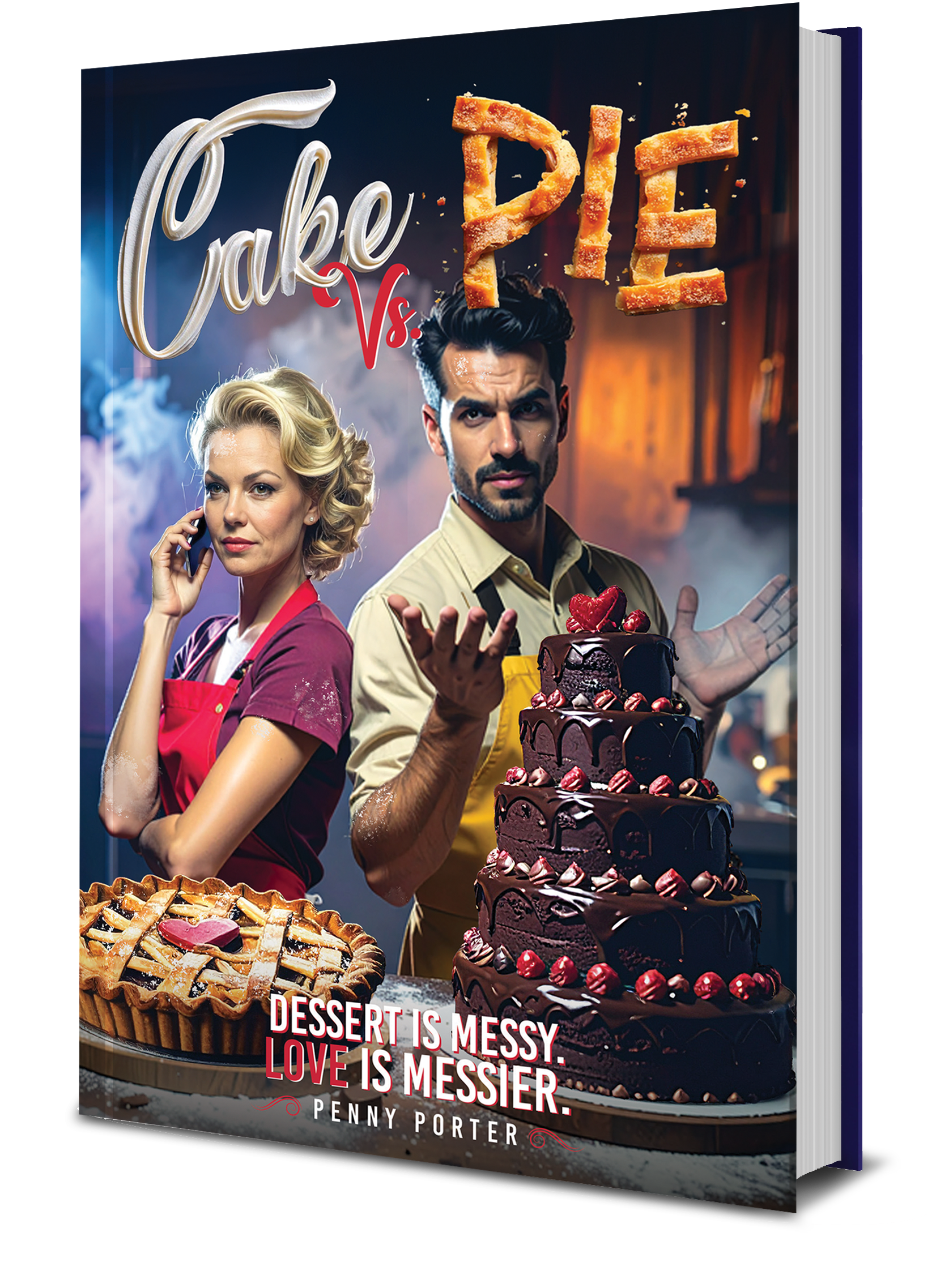
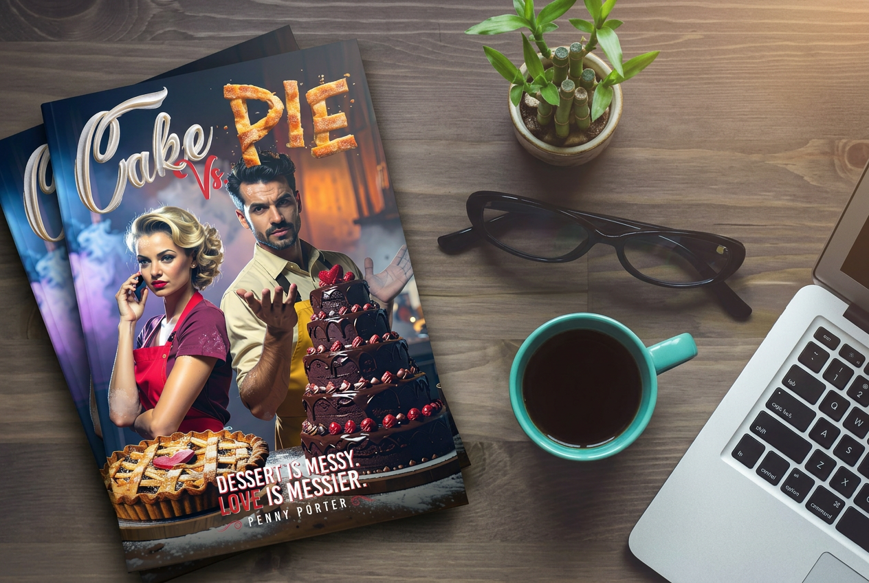
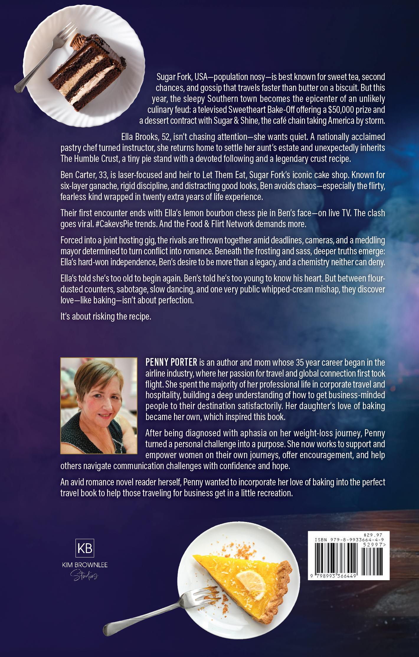
This book cover for Cake vs Pie was designed to visually capture the story’s playful rivalry and romantic tension through a bold, character-driven concept. As a creative studio, we developed a cinematic composition that places both protagonists front and center, each aligned with their signature dessert to instantly communicate conflict and chemistry. We combined styled food photography, expressive character direction, and a warm, dramatic lighting scheme to create depth, energy, and a sense of narrative in a single frame.
Our focus was on building a cohesive, market-ready design that stands out while clearly signaling genre. We crafted custom typography treatments—contrasting elegant script for “Cake” with textured, pastry-inspired lettering for “Pie”—to reinforce the theme visually. Careful attention was given to hierarchy, color balance, and thumbnail readability to ensure impact across digital platforms. The result is a high-converting cover that blends storytelling and strategy, giving the author a strong visual identity and immediate shelf appeal.
What we did
Concept development and creative direction
Character composition and visual storytelling
Custom typography and title treatment
Color grading and genre-specific styling
Final cover design for digital and print formats
Timeline
2–3 weeks from concept to final delivery
This book cover for Cake vs Pie was designed to visually capture the story’s playful rivalry and romantic tension through a bold, character-driven concept. As a creative studio, we developed a cinematic composition that places both protagonists front and center, each aligned with their signature dessert to instantly communicate conflict and chemistry. We combined styled food photography, expressive character direction, and a warm, dramatic lighting scheme to create depth, energy, and a sense of narrative in a single frame.
Our focus was on building a cohesive, market-ready design that stands out while clearly signaling genre. We crafted custom typography treatments—contrasting elegant script for “Cake” with textured, pastry-inspired lettering for “Pie”—to reinforce the theme visually. Careful attention was given to hierarchy, color balance, and thumbnail readability to ensure impact across digital platforms. The result is a high-converting cover that blends storytelling and strategy, giving the author a strong visual identity and immediate shelf appeal.
What we did
Concept development and creative direction
Character composition and visual storytelling
Custom typography and title treatment
Color grading and genre-specific styling
Final cover design for digital and print formats
Timeline
2–3 weeks from concept to final delivery
SEE SIMILAR WORK