CAKE VS. PIE
LAYOUT DESIGN
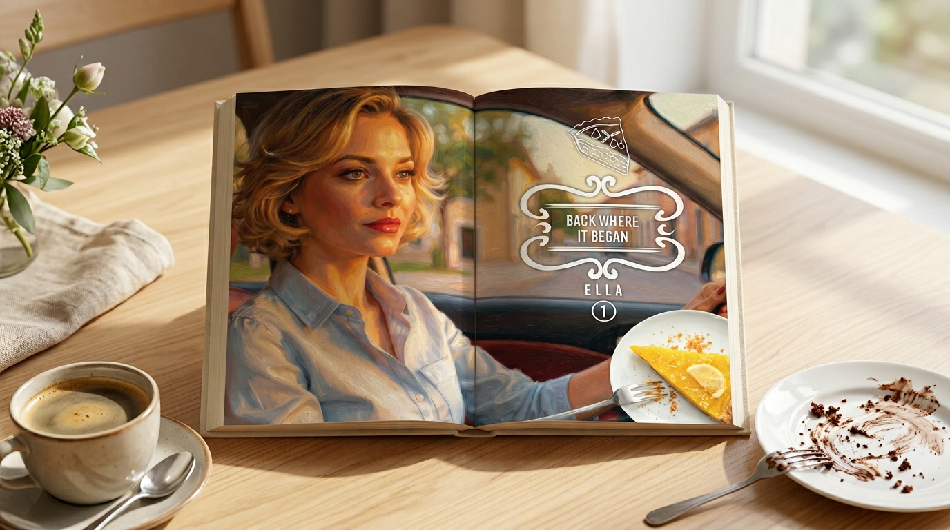
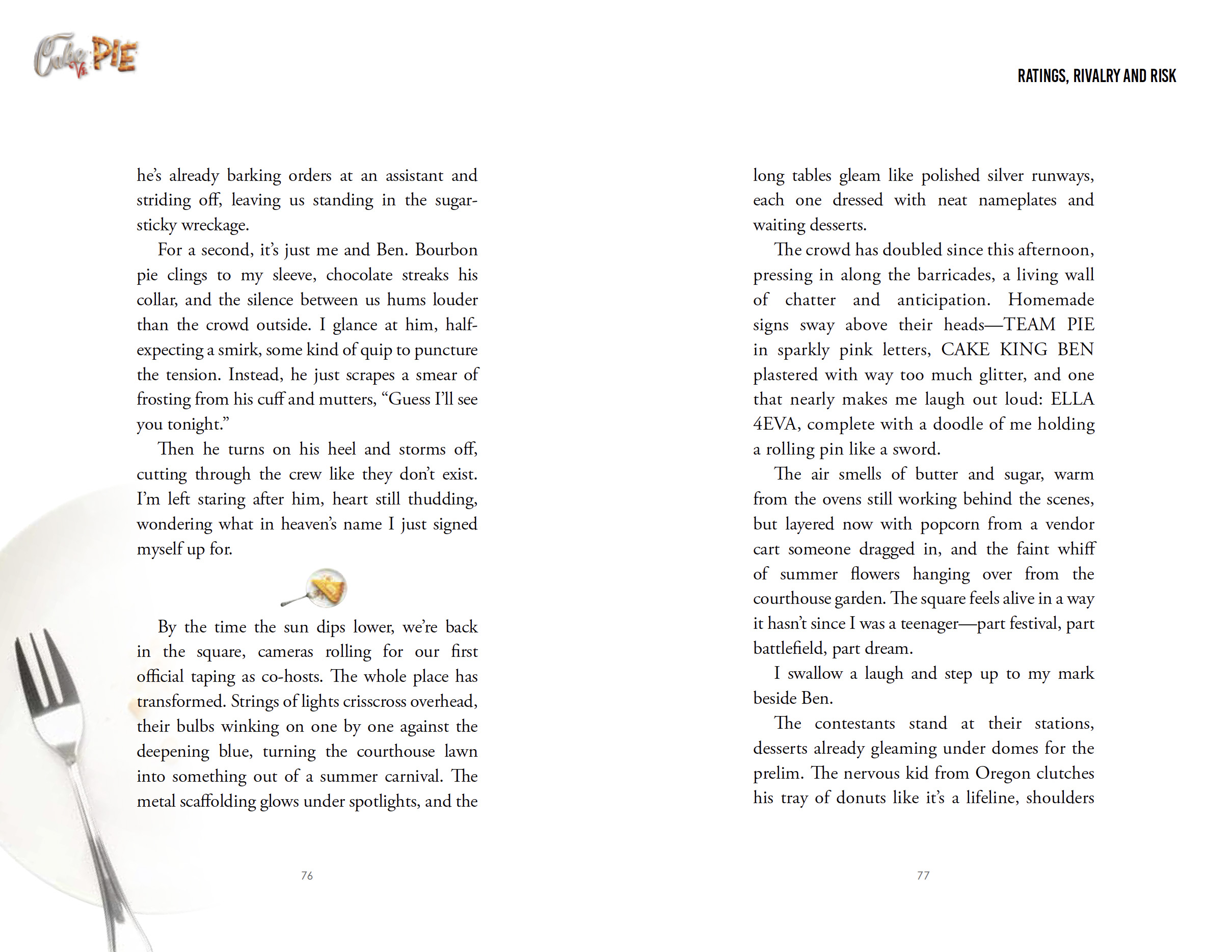
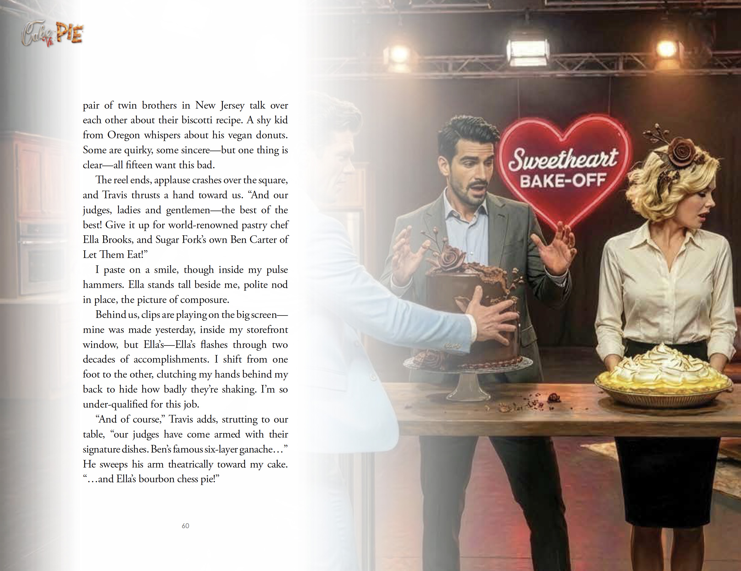
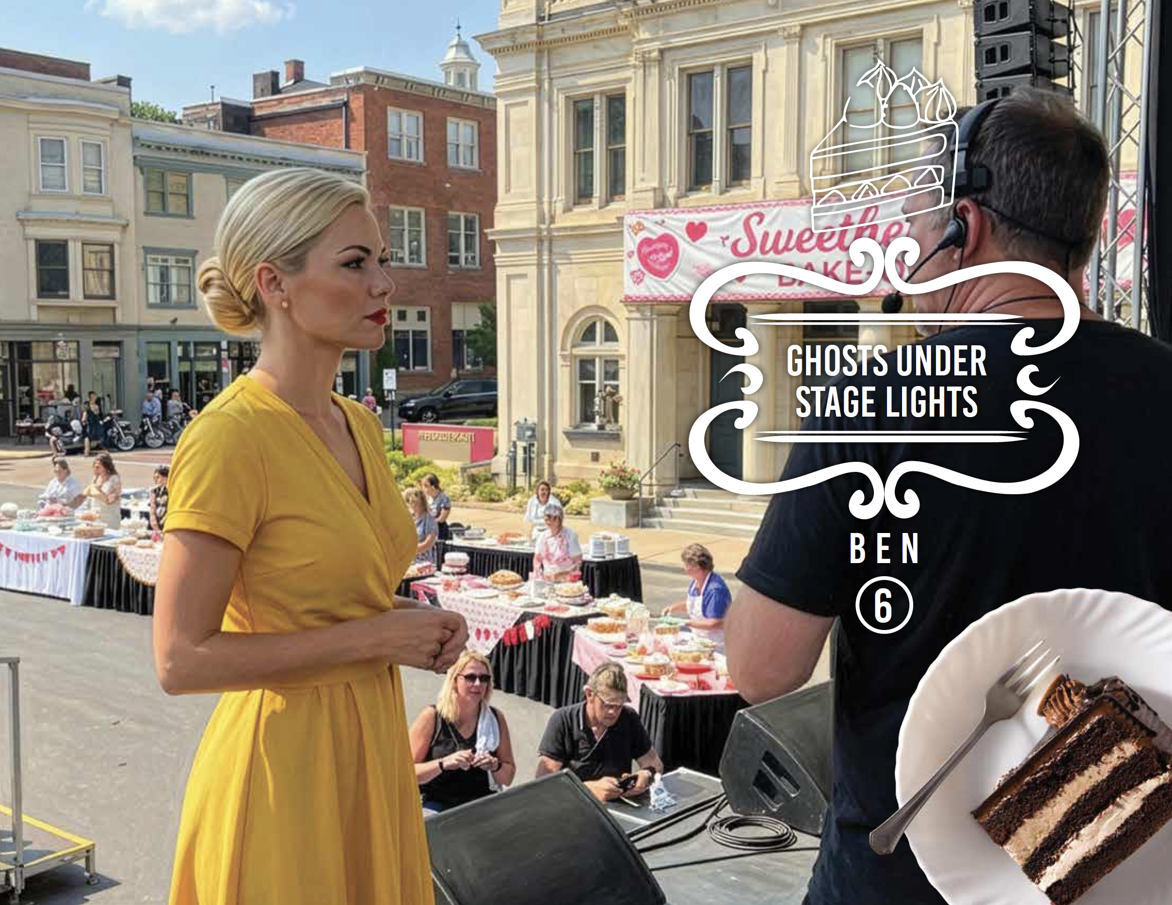
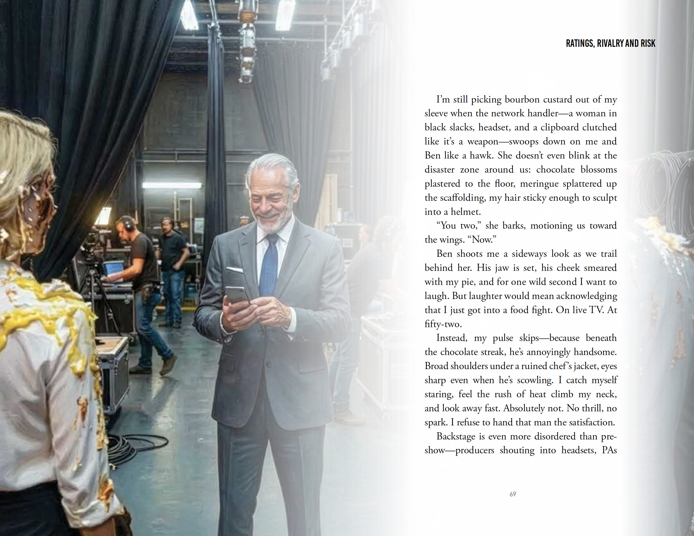
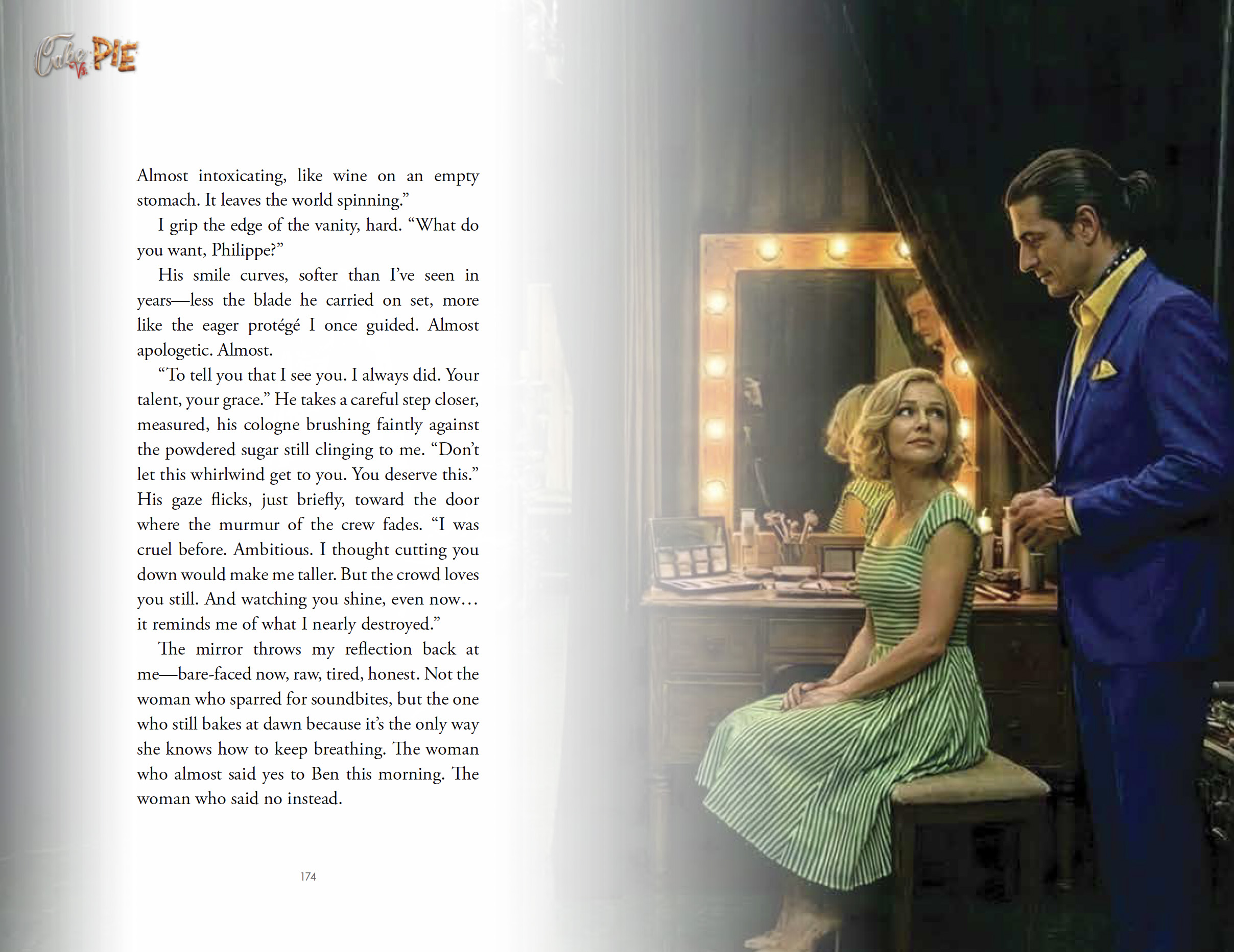
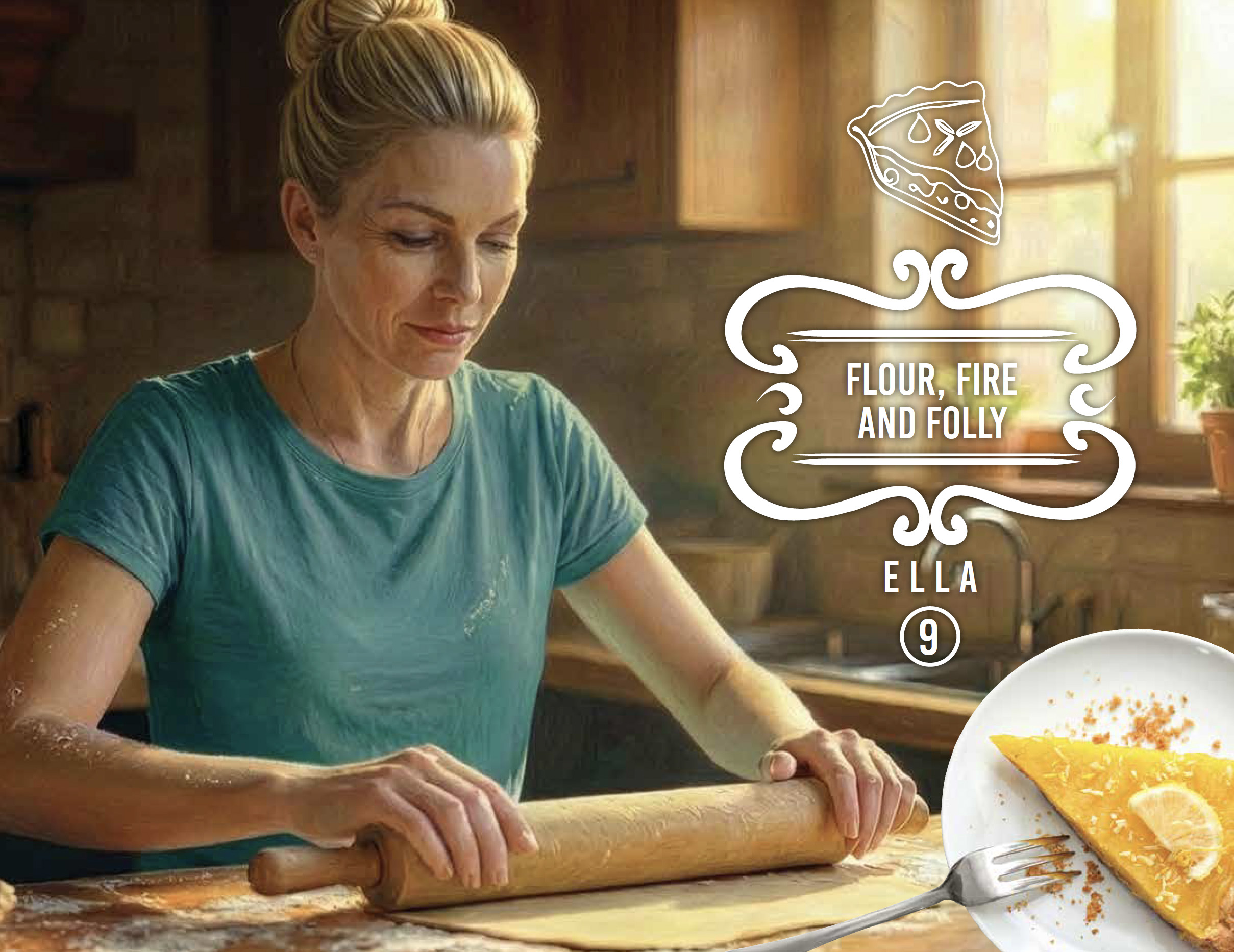
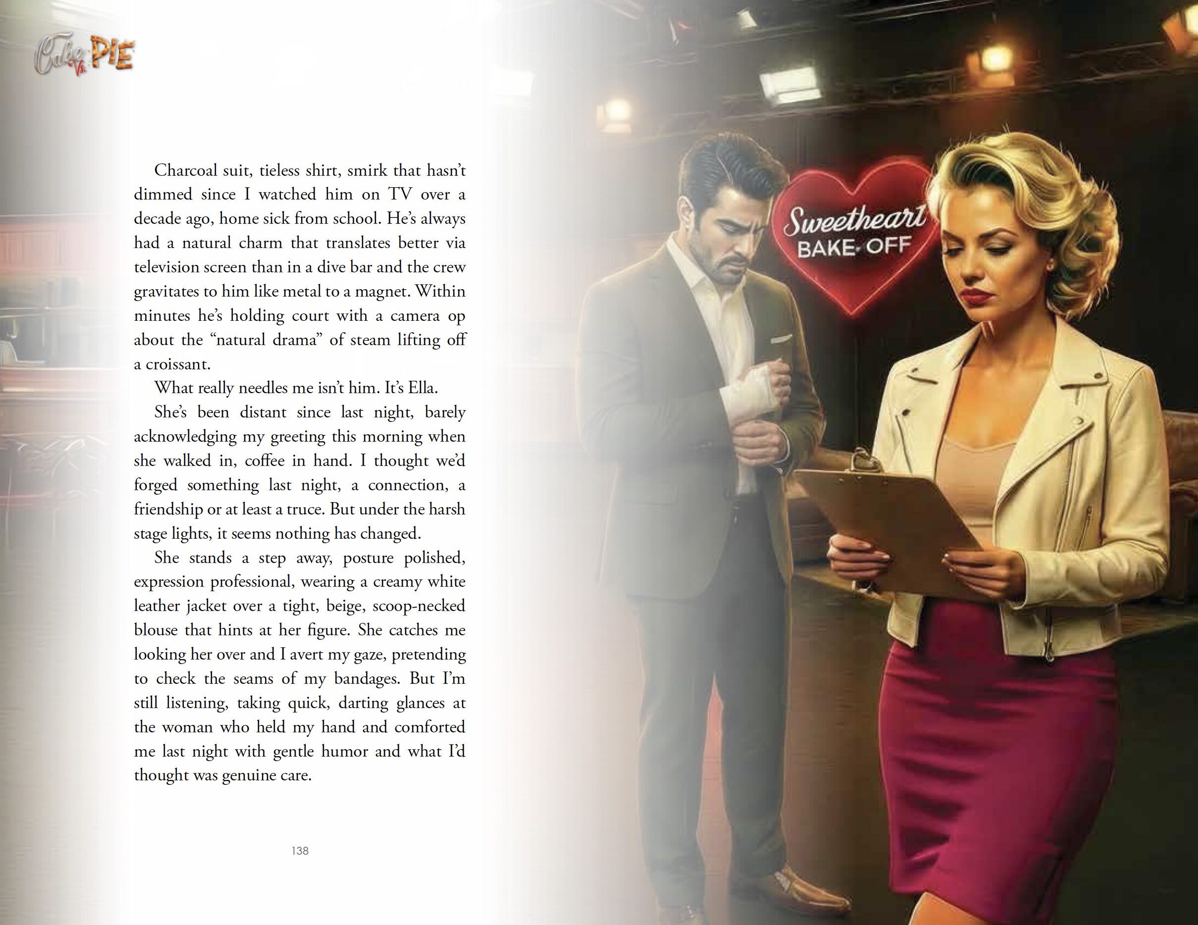
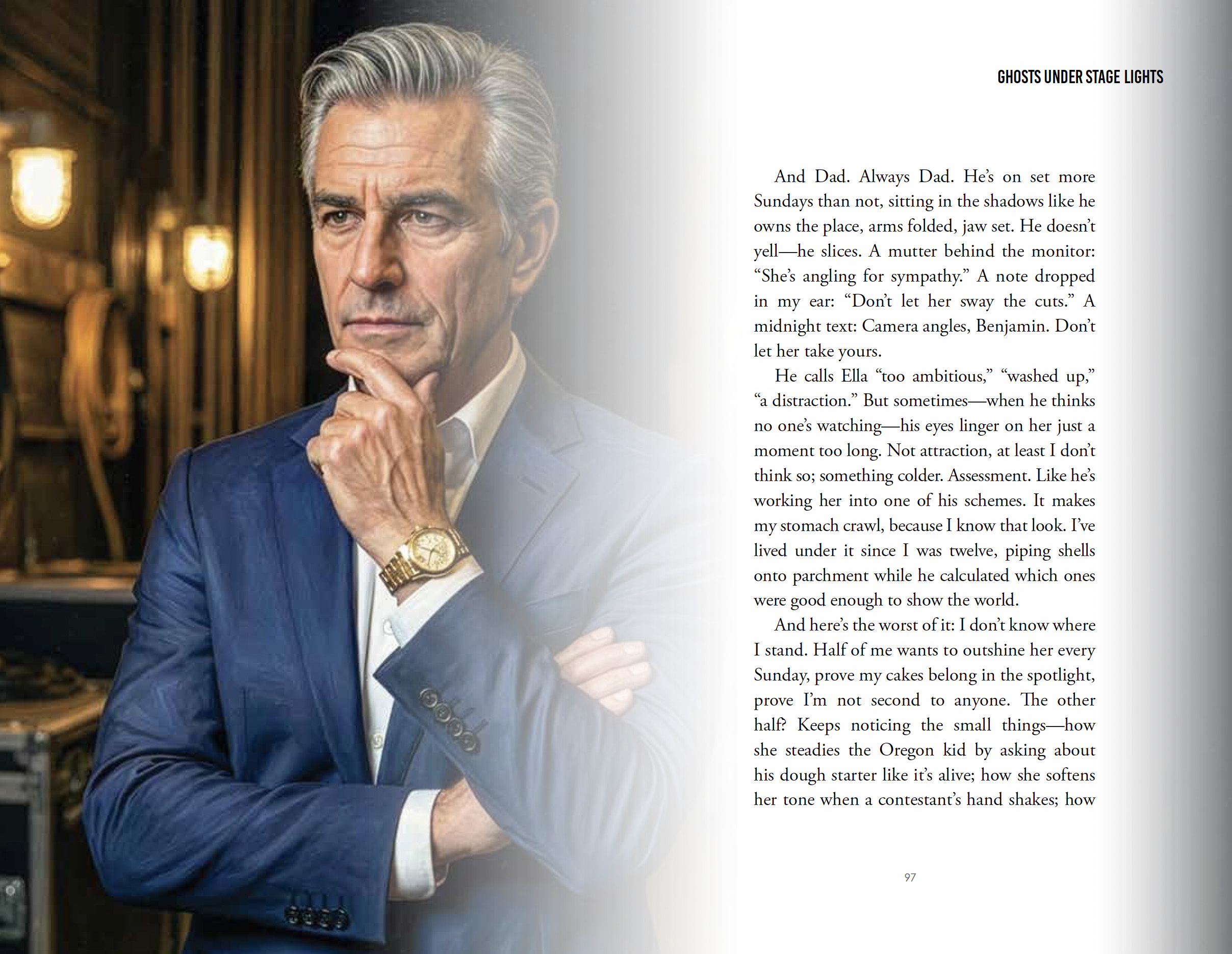
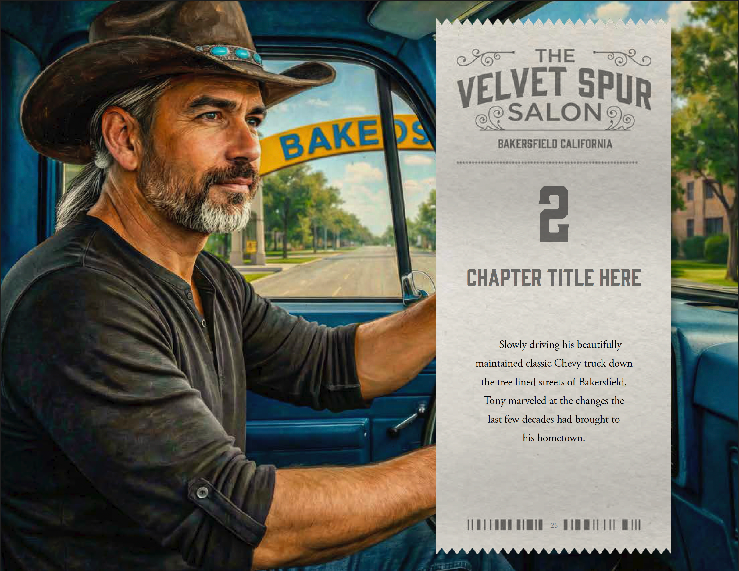
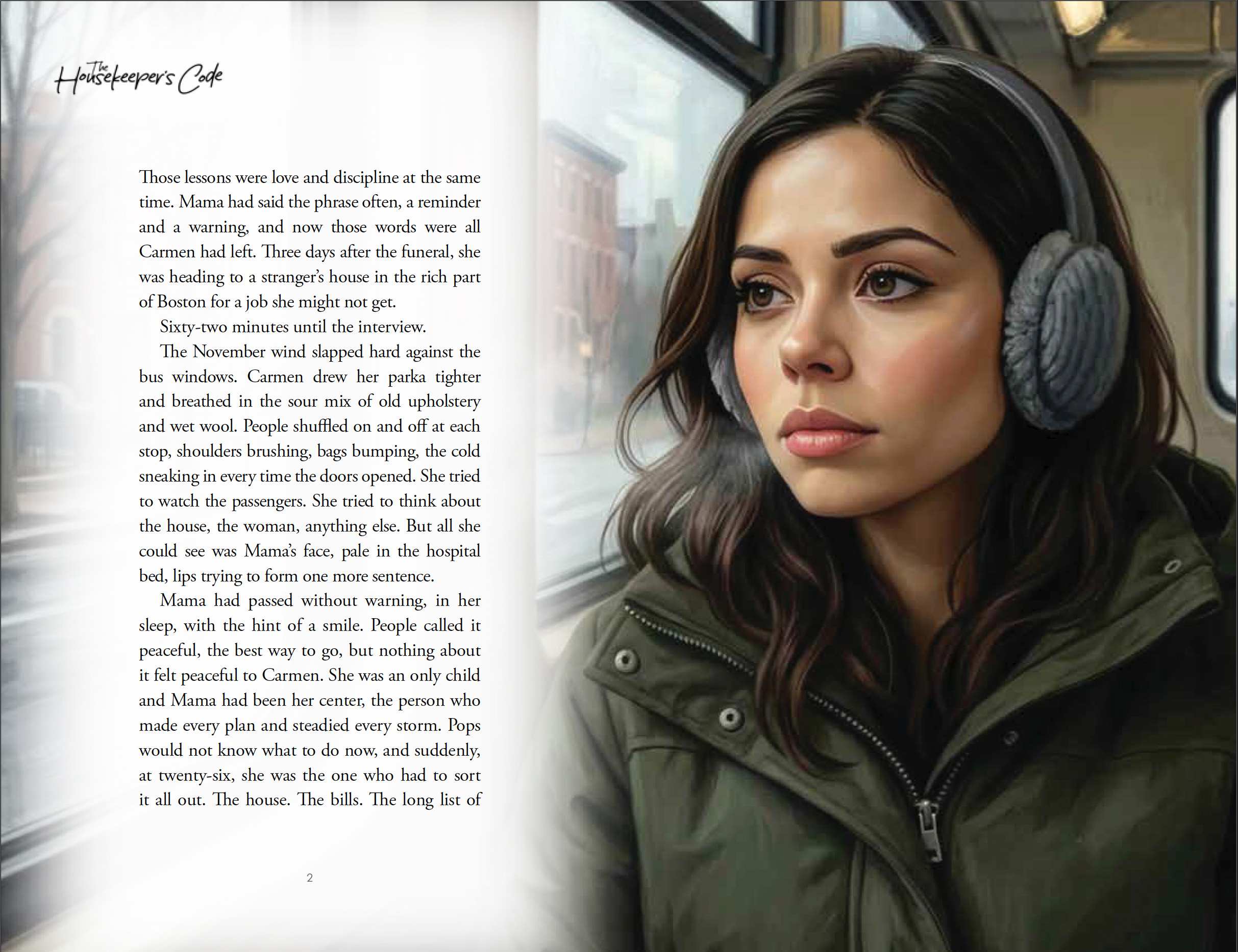
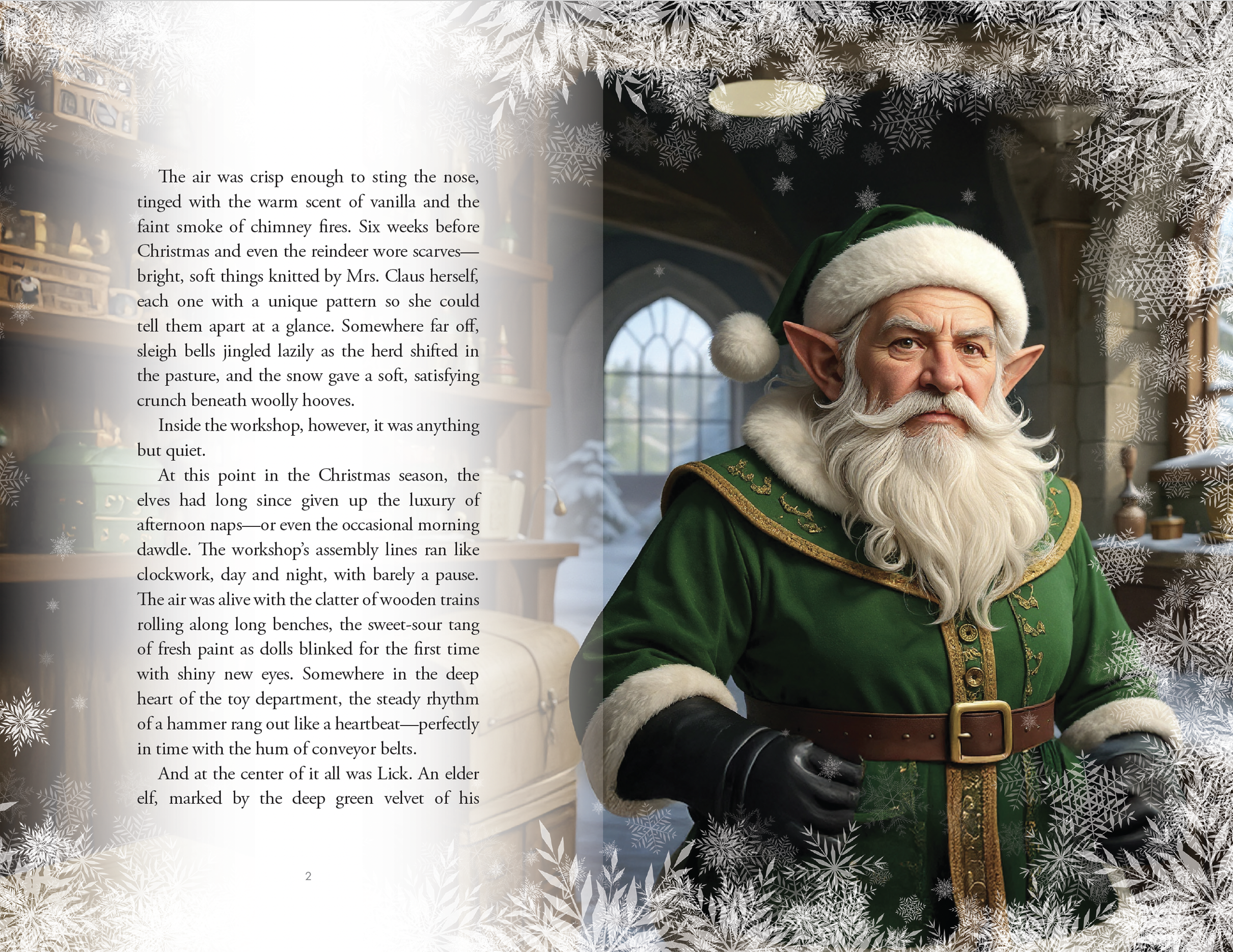
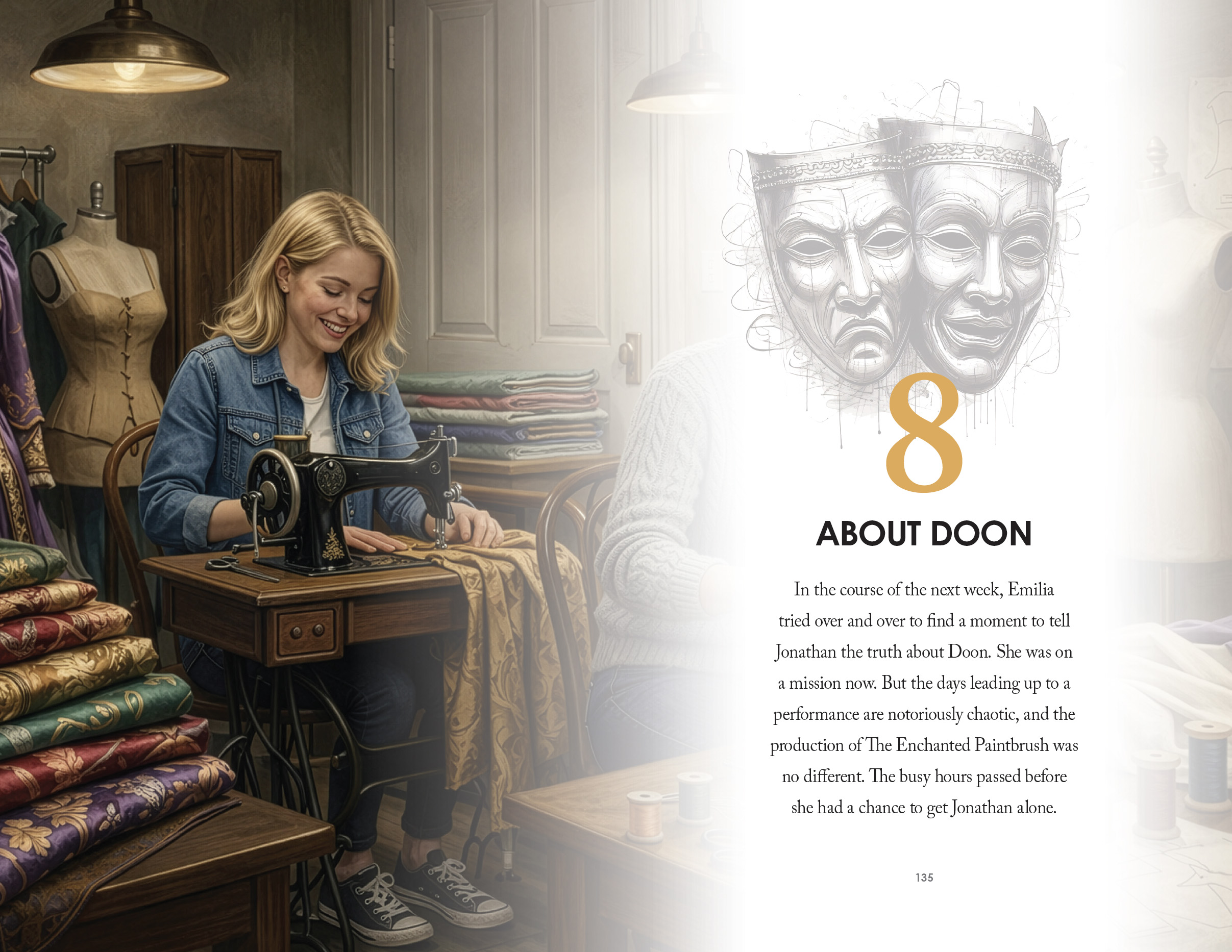
For this project, we designed a dynamic interior layout system that captures the energy and tension of a competitive, character-driven narrative while maintaining a clean, highly readable structure. Our team developed a consistent visual framework that blends cinematic, full-bleed imagery with softened text overlays, allowing each scene to feel immersive without compromising legibility. We established clear typographic hierarchies, pacing the content with intentional white space, chapter headers, and sectional breaks that guide the reader smoothly through shifts in perspective and tone.
We also created a suite of custom graphic elements—including chapter title treatments, ornamental frames, and branded motifs—that reinforce the book’s identity across every spread. Each layout was carefully composed to balance storytelling and design, ensuring that imagery enhances rather than competes with the text. The result is a cohesive, production-ready book interior that feels elevated, engaging, and thoughtfully crafted to support both the narrative flow and the author’s voice.
What we did
Designed a cohesive interior layout system aligned with the book’s theatrical theme
Established clear typographic hierarchy for chapters, body text, and key moments
Integrated scene-based visuals to enhance storytelling and pacing
Structured page flow for readability, rhythm, and visual balance
Prepared print-ready files optimized for both digital and physical formats
Timeline
2–3 months from concept to final delivery
For this project, we designed a dynamic interior layout system that captures the energy and tension of a competitive, character-driven narrative while maintaining a clean, highly readable structure. Our team developed a consistent visual framework that blends cinematic, full-bleed imagery with softened text overlays, allowing each scene to feel immersive without compromising legibility. We established clear typographic hierarchies, pacing the content with intentional white space, chapter headers, and sectional breaks that guide the reader smoothly through shifts in perspective and tone.
We also created a suite of custom graphic elements—including chapter title treatments, ornamental frames, and branded motifs—that reinforce the book’s identity across every spread. Each layout was carefully composed to balance storytelling and design, ensuring that imagery enhances rather than competes with the text. The result is a cohesive, production-ready book interior that feels elevated, engaging, and thoughtfully crafted to support both the narrative flow and the author’s voice.
What we did
Designed a cohesive interior layout system aligned with the book’s theatrical theme
Established clear typographic hierarchy for chapters, body text, and key moments
Integrated scene-based visuals to enhance storytelling and pacing
Structured page flow for readability, rhythm, and visual balance
Prepared print-ready files optimized for both digital and physical formats
Timeline
2–3 months from concept to final delivery
SEE SIMILAR WORK