DOON
BOOK COVER DESIGN
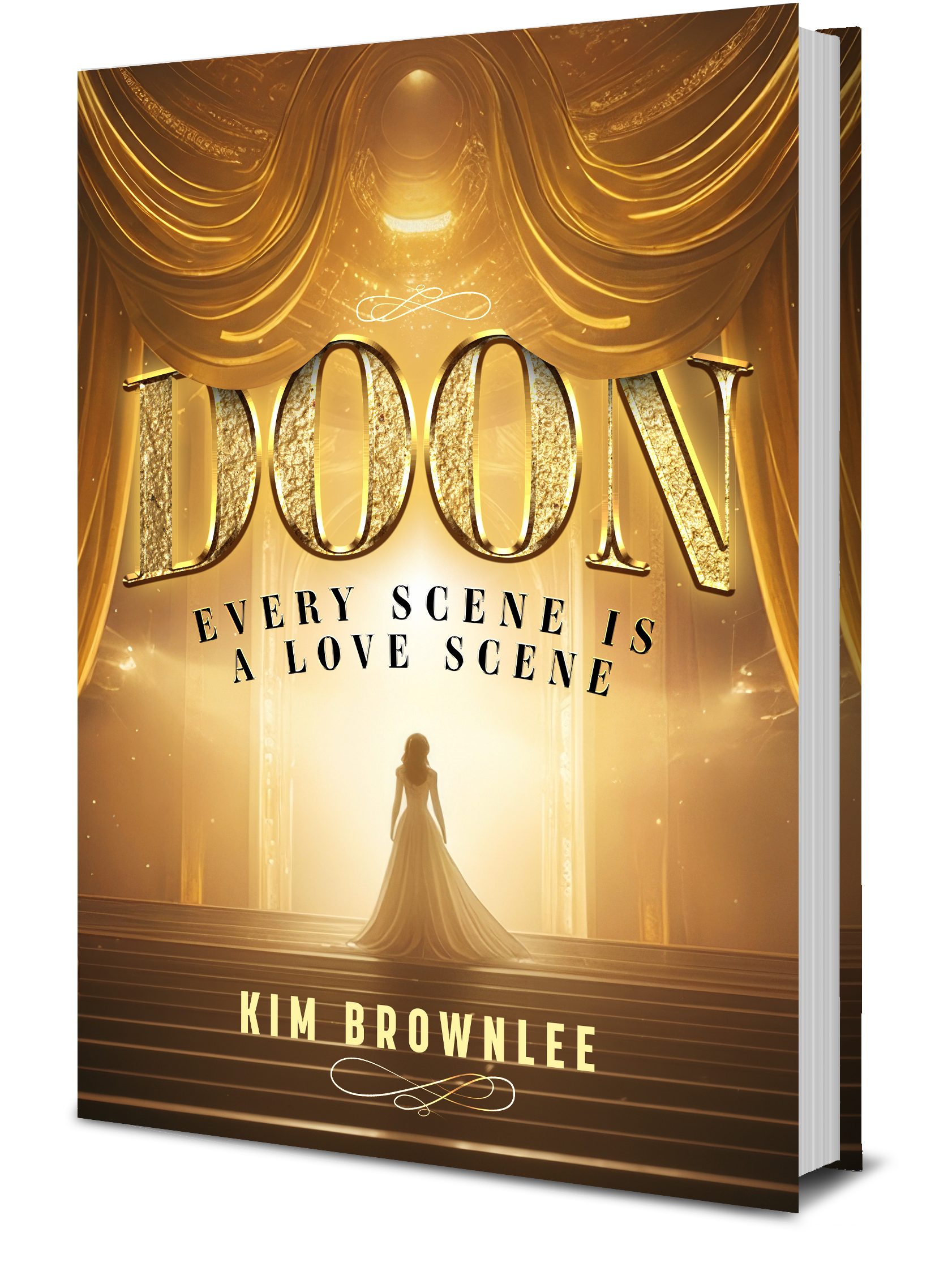

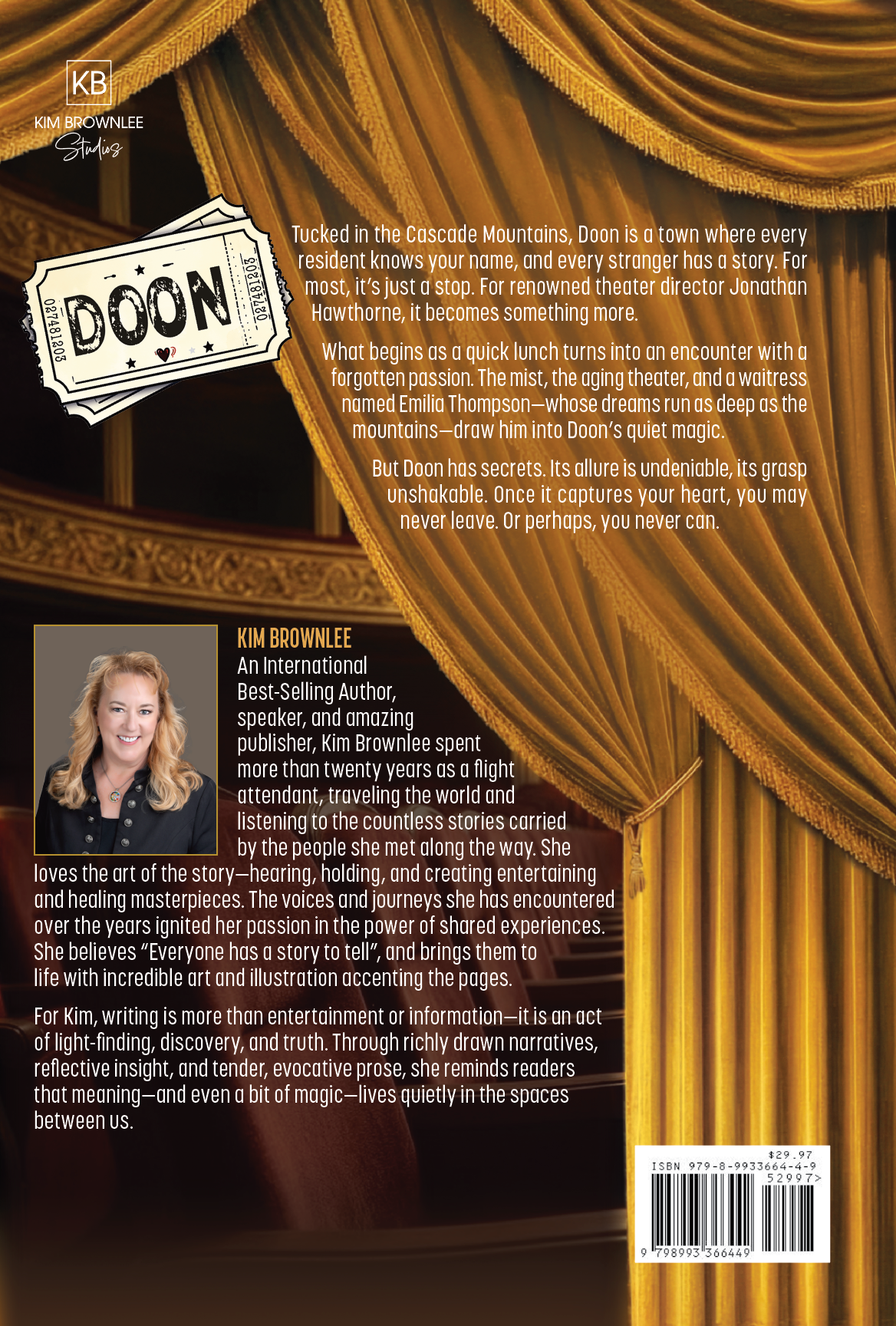
This book cover for Doon: Every Scene Is a Love Scene was designed to visually translate the novel’s core themes of romance, theater, and transformation into a striking, market-ready concept. We developed a cinematic art direction centered on stage-inspired elements—flowing drapery, dramatic lighting, and a central figure stepping into the spotlight—to symbolize both performance and emotional journey. The gold palette and luminous textures were intentionally chosen to evoke elegance and spectacle, aligning the cover with the story’s theatrical world.
As a creative studio, we focused on crafting a cohesive visual system that balances storytelling with strong commercial appeal. This included custom typography with dimensional, metallic finishes, precise composition for both full-size and thumbnail readability, and refined lighting effects to create depth and atmosphere. Every detail—from title hierarchy to focal placement—was designed to capture attention quickly while reinforcing the book’s tone, resulting in a polished cover that elevates the author’s brand and resonates with the target audience.
What we did
Concept development and creative direction
Character composition and visual storytelling
Custom typography and title treatment
Color grading and genre-specific styling
Final cover design for digital and print formats
Timeline
2–3 weeks from concept to final delivery
This book cover for Doon: Every Scene Is a Love Scene was designed to visually translate the novel’s core themes of romance, theater, and transformation into a striking, market-ready concept. We developed a cinematic art direction centered on stage-inspired elements—flowing drapery, dramatic lighting, and a central figure stepping into the spotlight—to symbolize both performance and emotional journey. The gold palette and luminous textures were intentionally chosen to evoke elegance and spectacle, aligning the cover with the story’s theatrical world.
As a creative studio, we focused on crafting a cohesive visual system that balances storytelling with strong commercial appeal. This included custom typography with dimensional, metallic finishes, precise composition for both full-size and thumbnail readability, and refined lighting effects to create depth and atmosphere. Every detail—from title hierarchy to focal placement—was designed to capture attention quickly while reinforcing the book’s tone, resulting in a polished cover that elevates the author’s brand and resonates with the target audience.
What we did
Concept development and creative direction
Character composition and visual storytelling
Custom typography and title treatment
Color grading and genre-specific styling
Final cover design for digital and print formats
Timeline
2–3 weeks from concept to final delivery
SEE SIMILAR WORK