I SHOULD HAVE BEEN A COWBOY
BOOK COVER DESIGN
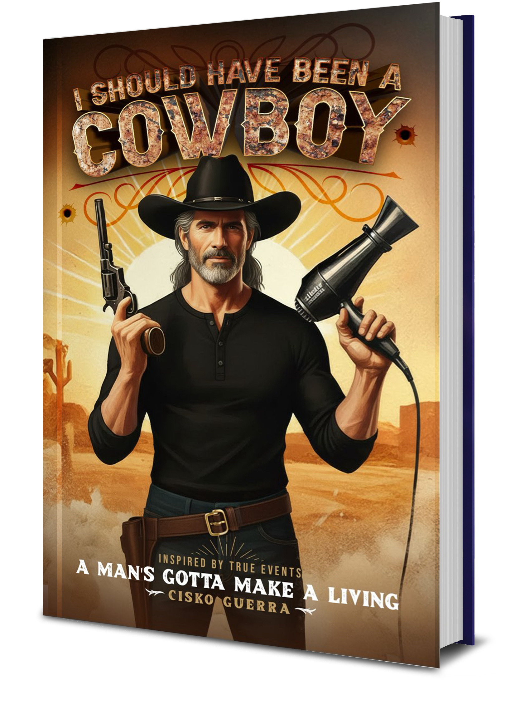
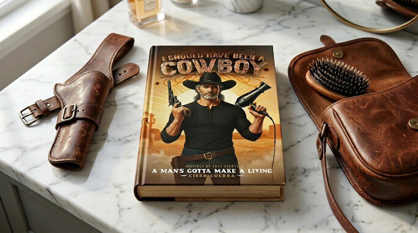
This book cover for I Should Have Been a Cowboy was designed to capture a bold, genre-blending concept—merging Western grit with modern storytelling. As a creative studio, we developed a strong central character-driven composition that immediately establishes tone and intrigue. By pairing iconic Western elements, like the revolver and desert backdrop, with an unexpected prop, we visually hint at the story’s unique twist. The warm, sun-washed palette and dust-filled atmosphere reinforce the rugged setting, while keeping the design cinematic and contemporary.
Our focus was on creating a cover that balances personality with strong market positioning. We crafted custom, textured typography to echo the raw, weathered feel of the genre, while ensuring clear hierarchy and readability across formats. Every element—from character styling and prop selection to lighting and layout—was intentionally designed to communicate story, genre, and tone at a glance. The result is a distinctive, high-impact cover that stands out in a crowded market and gives the author a memorable visual identity.
What we did
Concept development and creative direction
Character composition and visual storytelling
Custom typography and title treatment
Color grading and genre-specific styling
Final cover design for digital and print formats
Timeline
2–3 weeks from concept to final delivery
This book cover for I Should Have Been a Cowboy was designed to capture a bold, genre-blending concept—merging Western grit with modern storytelling. As a creative studio, we developed a strong central character-driven composition that immediately establishes tone and intrigue. By pairing iconic Western elements, like the revolver and desert backdrop, with an unexpected prop, we visually hint at the story’s unique twist. The warm, sun-washed palette and dust-filled atmosphere reinforce the rugged setting, while keeping the design cinematic and contemporary.
Our focus was on creating a cover that balances personality with strong market positioning. We crafted custom, textured typography to echo the raw, weathered feel of the genre, while ensuring clear hierarchy and readability across formats. Every element—from character styling and prop selection to lighting and layout—was intentionally designed to communicate story, genre, and tone at a glance. The result is a distinctive, high-impact cover that stands out in a crowded market and gives the author a memorable visual identity.
What we did
Concept development and creative direction
Character composition and visual storytelling
Custom typography and title treatment
Color grading and genre-specific styling
Final cover design for digital and print formats
Timeline
2–3 weeks from concept to final delivery
SEE SIMILAR WORK