I SHOULD HAVE BEEN A COWBOY
LAYOUT DESIGN
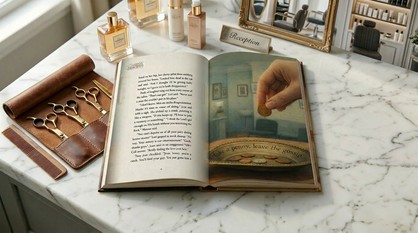
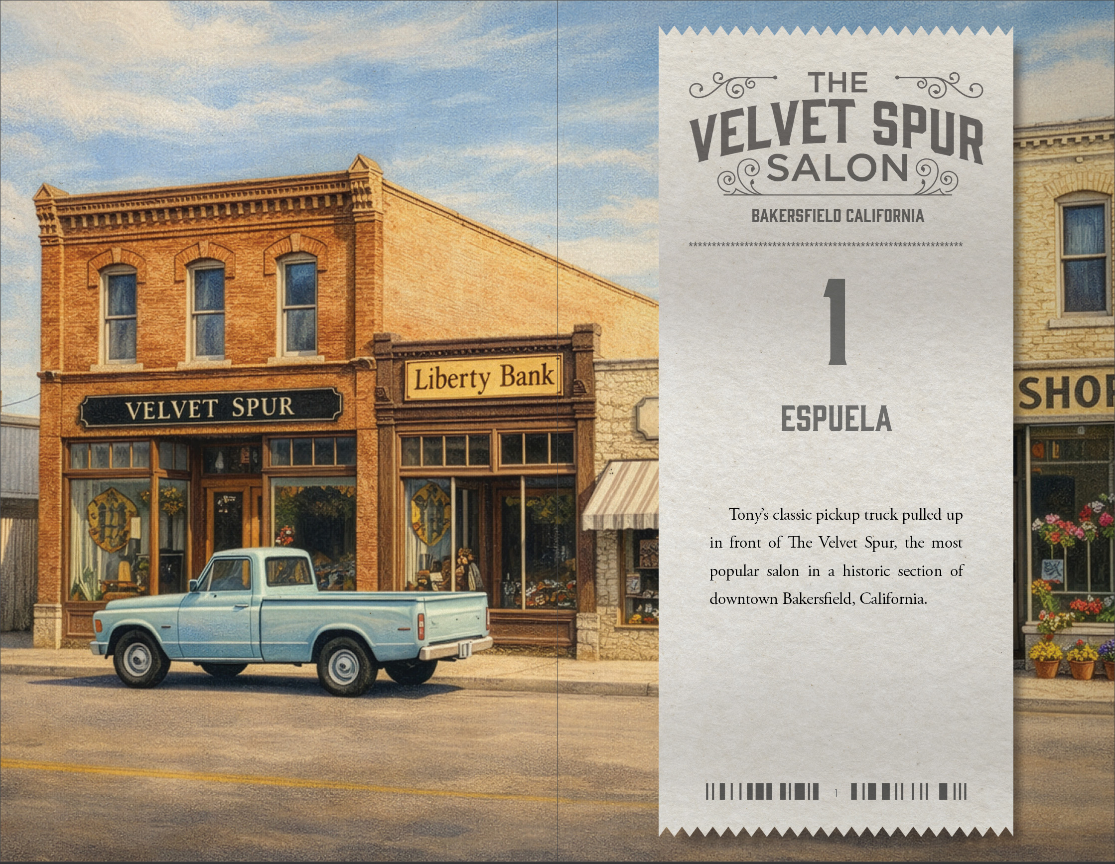
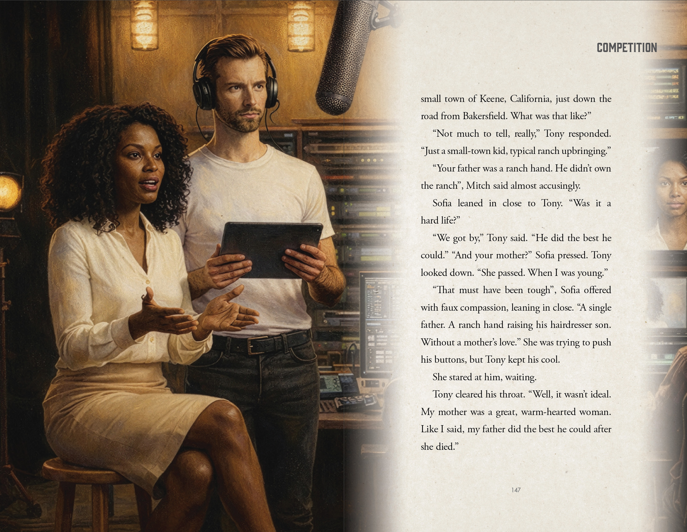
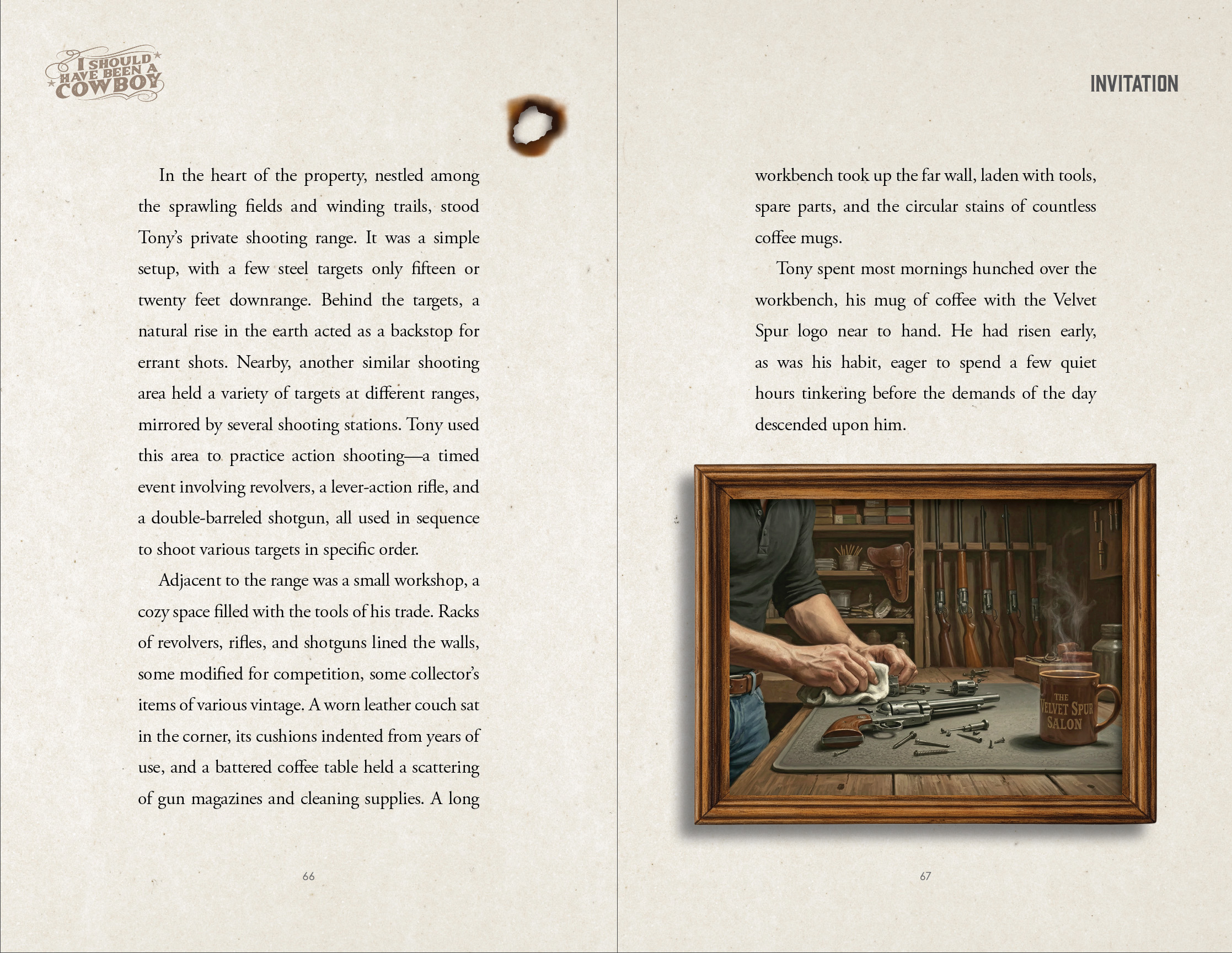
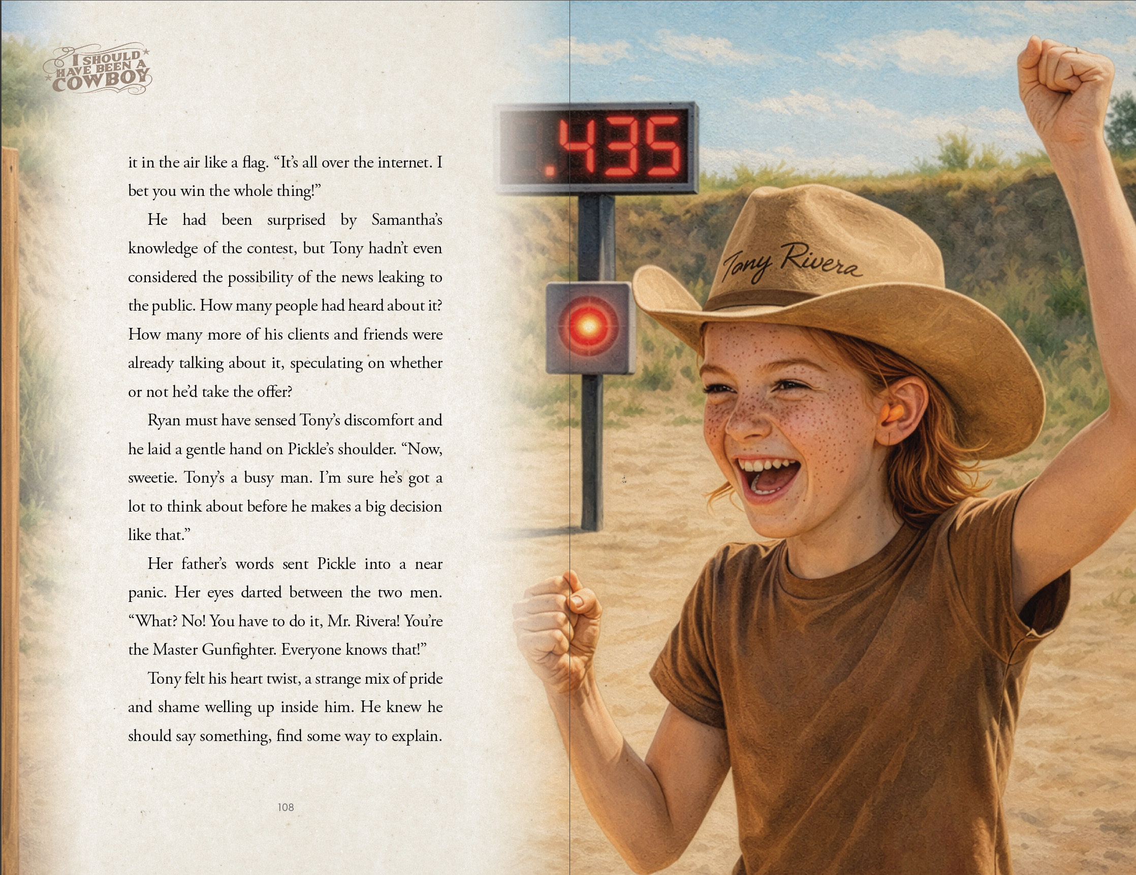
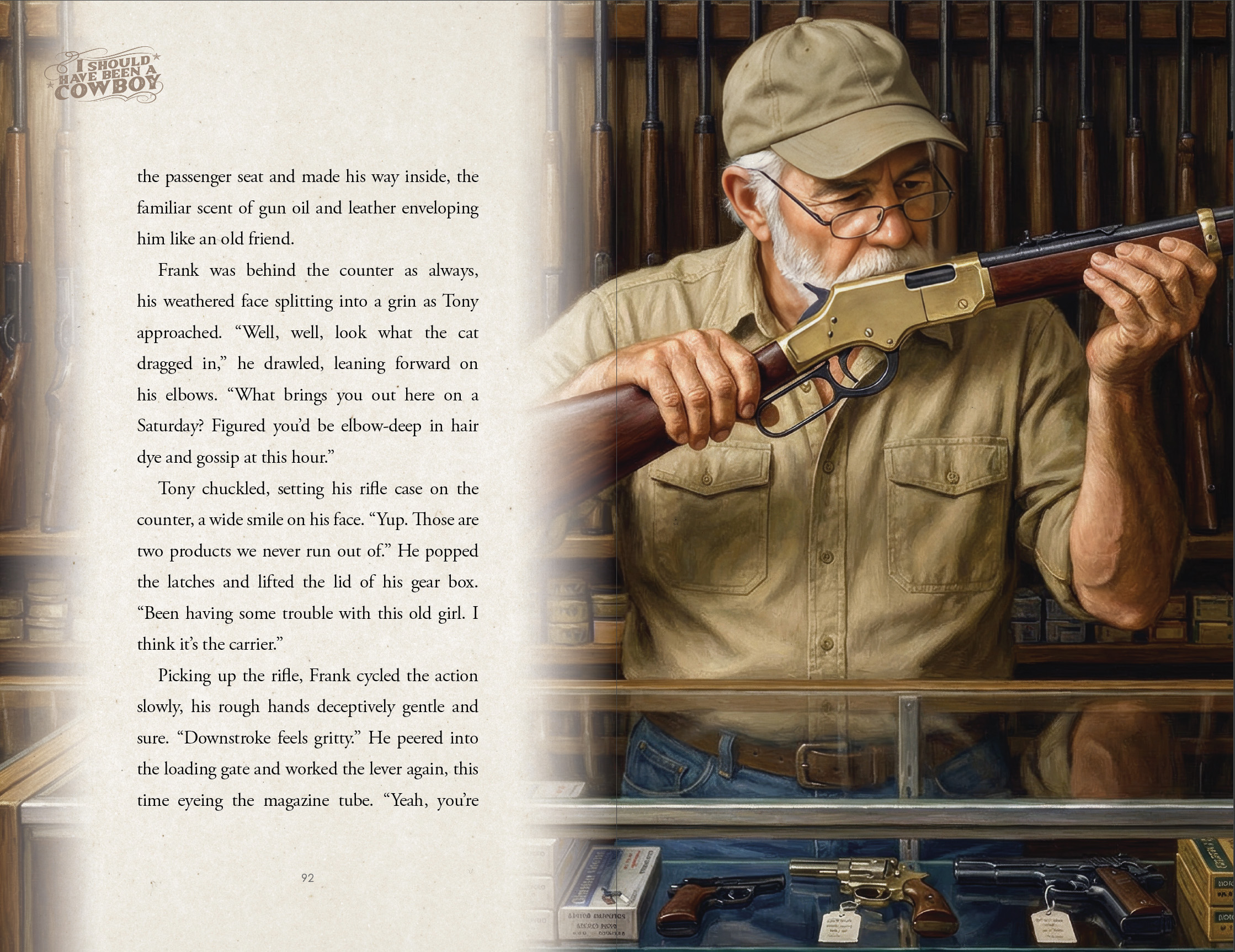
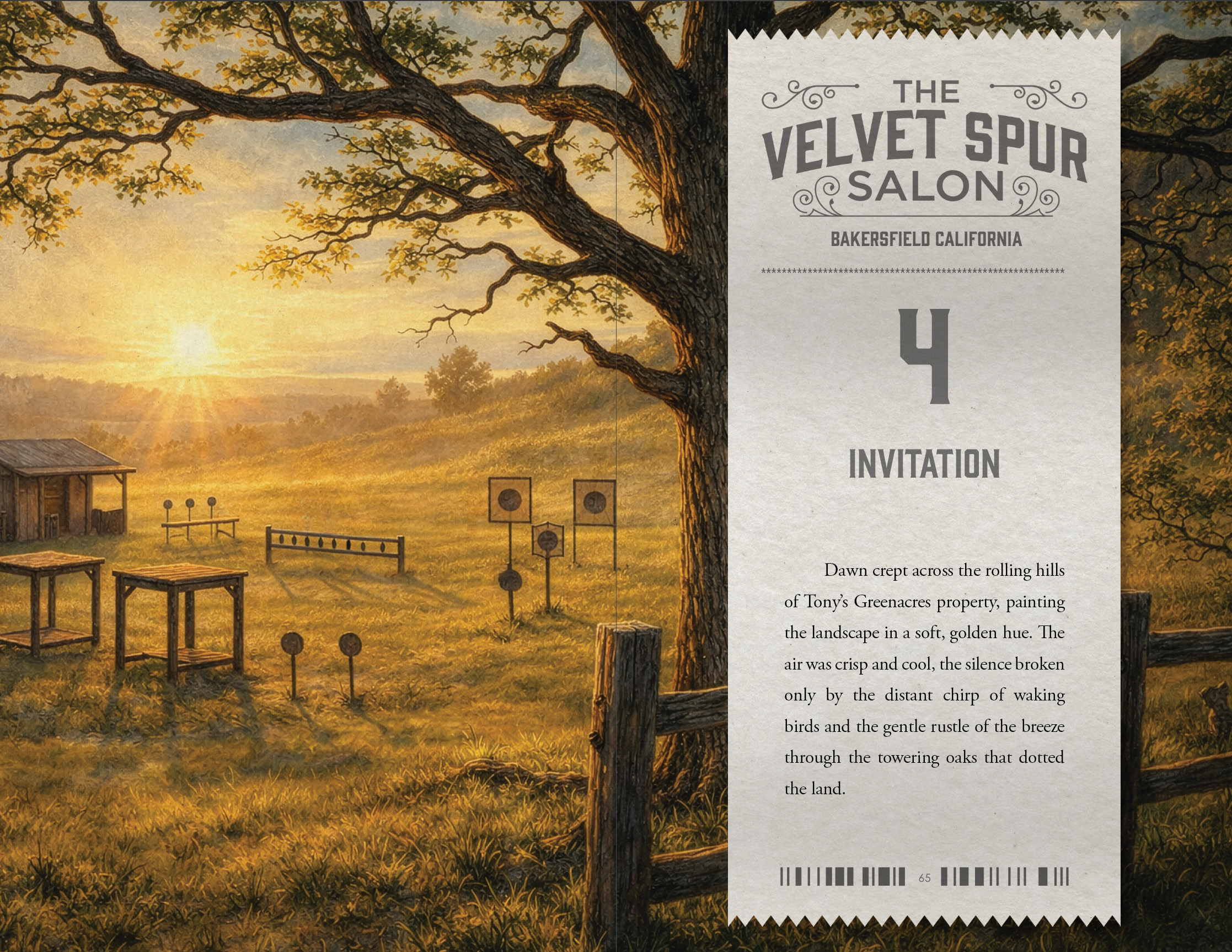
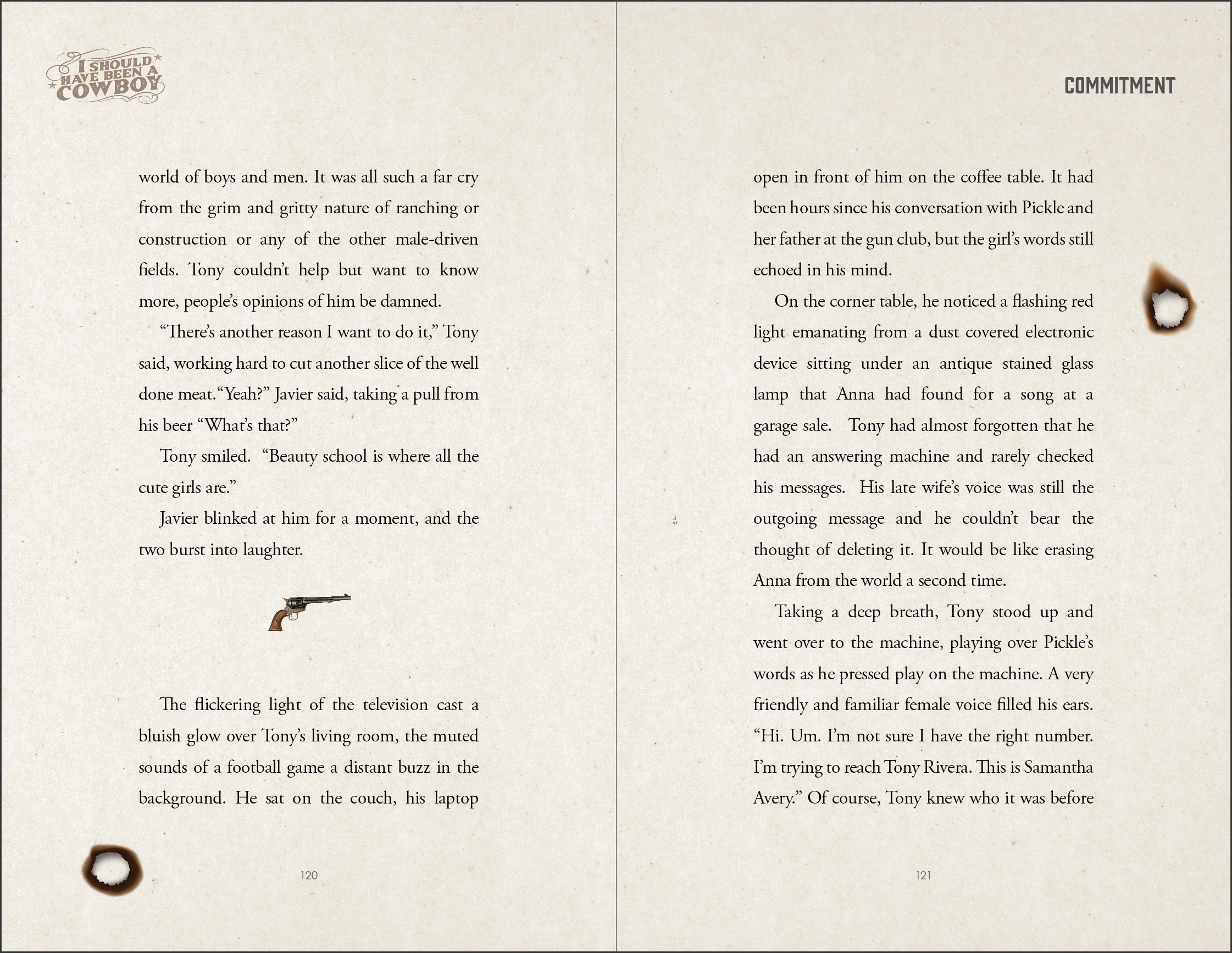
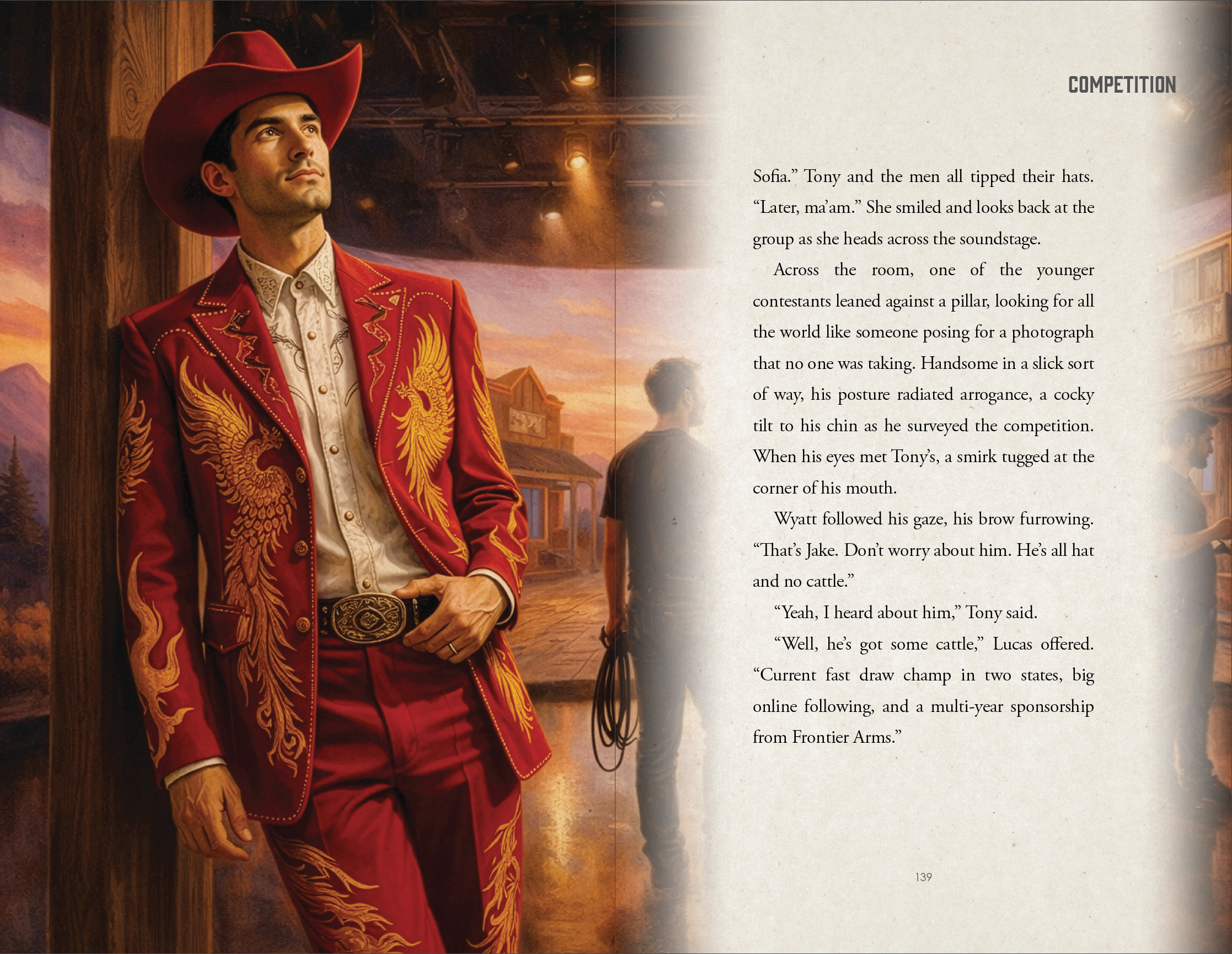
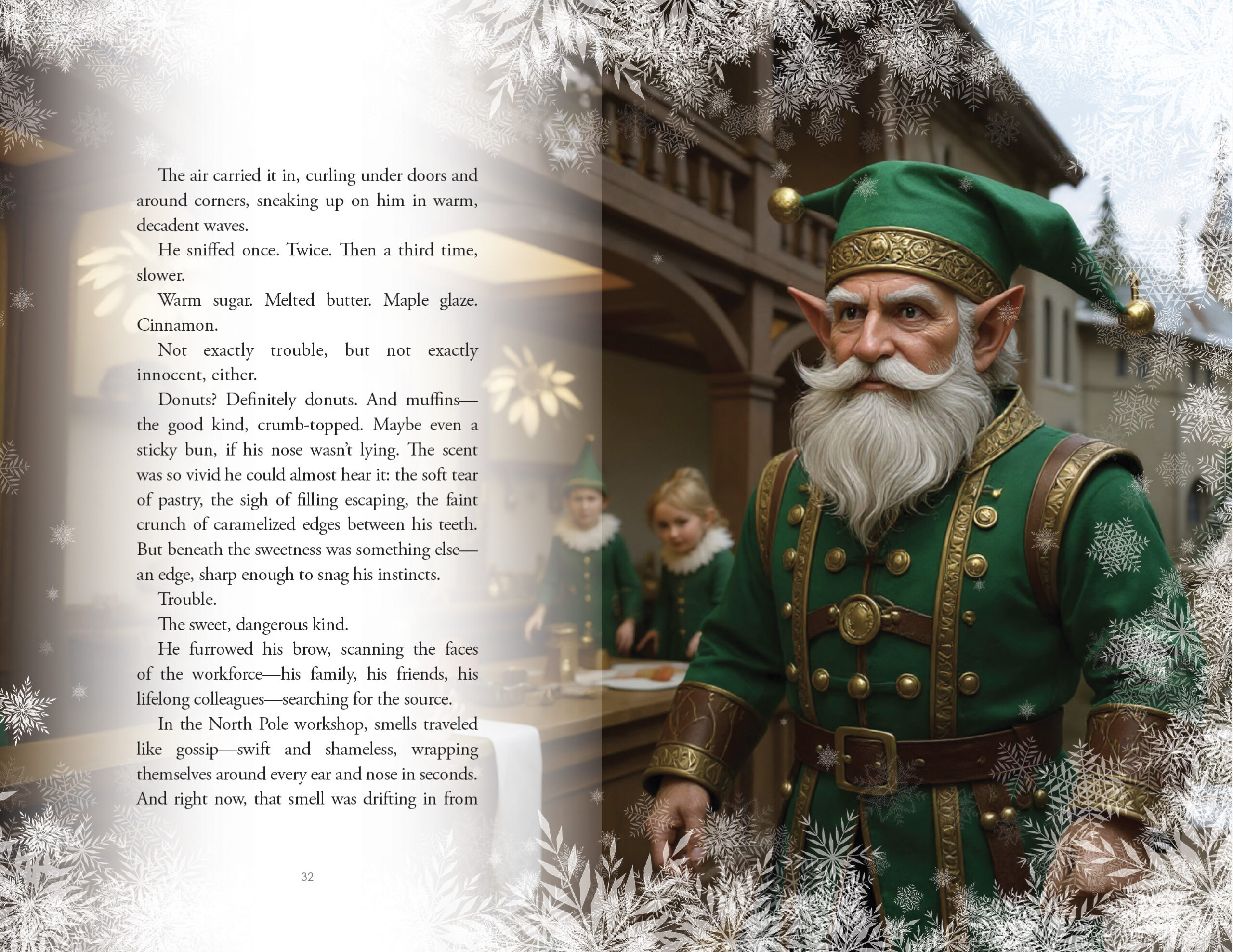
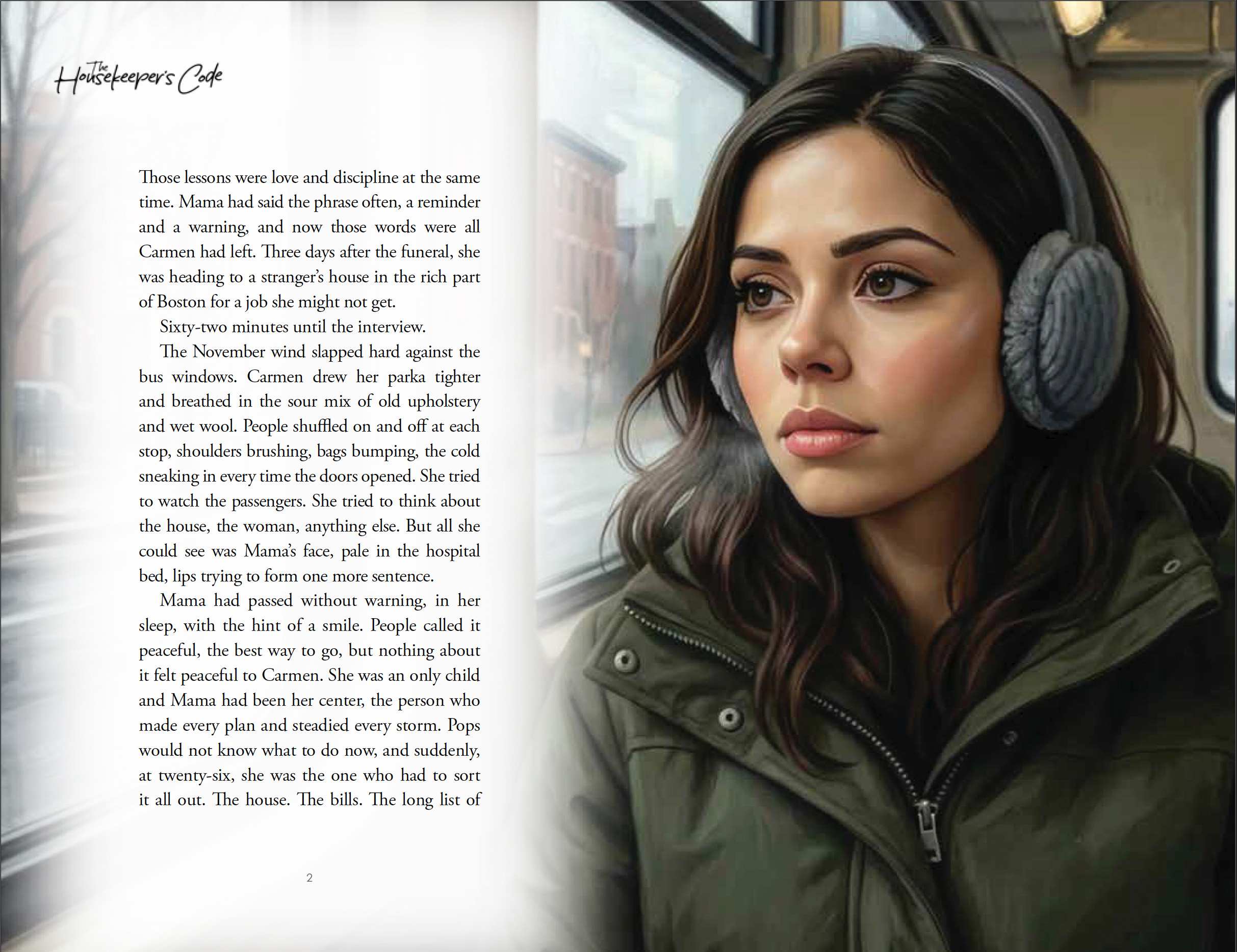
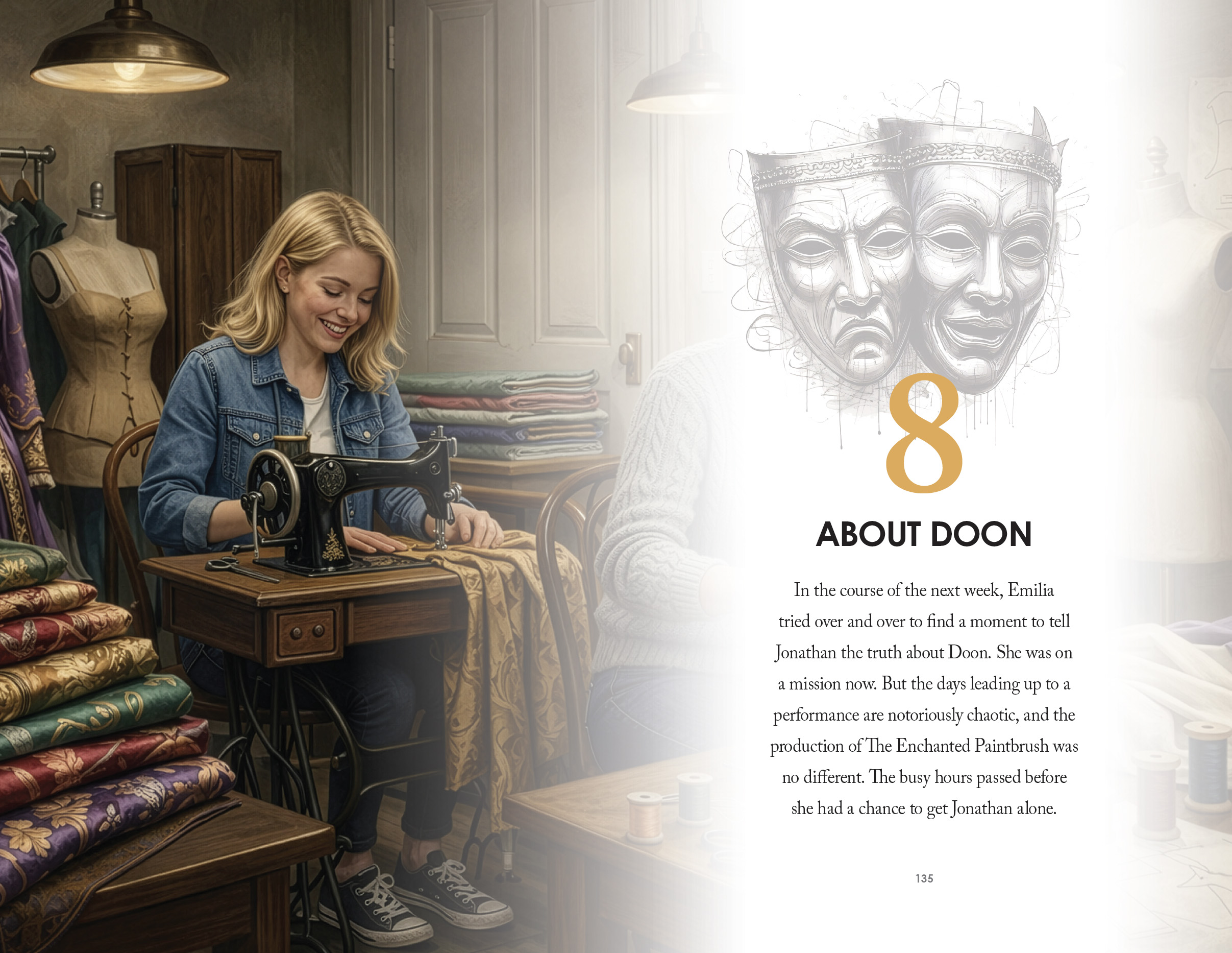
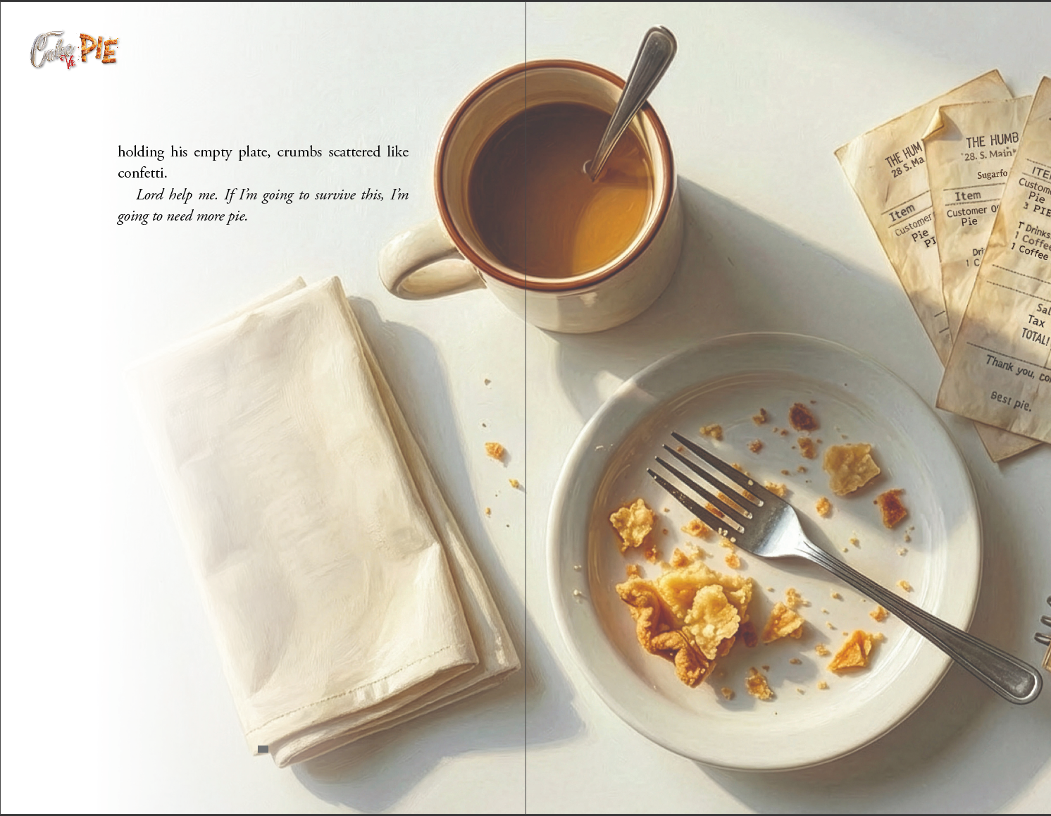
For this project, we partnered with the author to design a fully immersive interior layout that blended cinematic storytelling with handcrafted illustration. Our approach centered on creating a seamless dialogue between text and image—where each spread functions as both narrative progression and visual experience. We developed a cohesive art direction inspired by modern Western aesthetics, then produced a series of custom illustrations that feel painterly, character-driven, and emotionally grounded. From chapter openers to full-bleed scene compositions, every visual was intentionally designed to enhance pacing, reinforce tone, and deepen reader connection to key moments in the story.
On the design side, we built a bespoke layout system that integrates typography, negative space, and imagery into a refined, collectible-quality book interior. We carefully structured page rhythm—balancing richly illustrated spreads with clean, readable text pages—to maintain engagement without overwhelming the narrative. Custom chapter title treatments, subtle texture overlays, and print-aware composition ensured the final product felt premium and cohesive from cover to closing page. The result is a distinctive, elevated reading experience that positions the book not just as a story, but as a visual artifact—demonstrating how thoughtful design and original illustration can transform a manuscript into a standout piece of author-driven storytelling.
What we did
Designed a cohesive interior layout system aligned with the book’s theatrical theme
Established clear typographic hierarchy for chapters, body text, and key moments
Integrated scene-based visuals to enhance storytelling and pacing
Structured page flow for readability, rhythm, and visual balance
Prepared print-ready files optimized for both digital and physical formats
Timeline
2–3 months from concept to final delivery
For this project, we partnered with the author to design a fully immersive interior layout that blended cinematic storytelling with handcrafted illustration. Our approach centered on creating a seamless dialogue between text and image—where each spread functions as both narrative progression and visual experience. We developed a cohesive art direction inspired by modern Western aesthetics, then produced a series of custom illustrations that feel painterly, character-driven, and emotionally grounded. From chapter openers to full-bleed scene compositions, every visual was intentionally designed to enhance pacing, reinforce tone, and deepen reader connection to key moments in the story.
On the design side, we built a bespoke layout system that integrates typography, negative space, and imagery into a refined, collectible-quality book interior. We carefully structured page rhythm—balancing richly illustrated spreads with clean, readable text pages—to maintain engagement without overwhelming the narrative. Custom chapter title treatments, subtle texture overlays, and print-aware composition ensured the final product felt premium and cohesive from cover to closing page. The result is a distinctive, elevated reading experience that positions the book not just as a story, but as a visual artifact—demonstrating how thoughtful design and original illustration can transform a manuscript into a standout piece of author-driven storytelling.
What we did
Designed a cohesive interior layout system aligned with the book’s theatrical theme
Established clear typographic hierarchy for chapters, body text, and key moments
Integrated scene-based visuals to enhance storytelling and pacing
Structured page flow for readability, rhythm, and visual balance
Prepared print-ready files optimized for both digital and physical formats
Timeline
2–3 months from concept to final delivery
SEE SIMILAR WORK