THE HOUSEKEEPER’S CODE
BOOK COVER DESIGN

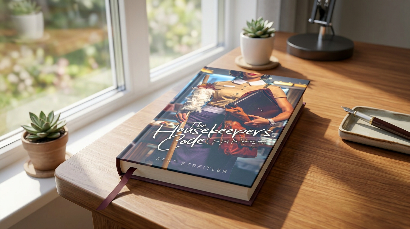
This book cover for The Housekeeper’s Code was designed to visually communicate intrigue, dual identity, and quiet strength through a clean, character-focused concept. As a creative studio, we built the composition around a single, cropped subject to create mystery—revealing just enough detail to suggest story without giving it away. By combining contrasting elements—a housekeeping uniform, professional accessories, and subtle styling—we hint at layers beneath the surface, reinforcing the narrative tension.
Our approach focused on blending modern typography with strong visual storytelling. We developed a handwritten-style title treatment to add personality and immediacy, while maintaining clear hierarchy and readability across formats. Lighting, color grading, and depth were carefully refined to create a polished, cinematic look that elevates the everyday setting. The result is a distinctive, market-ready cover that captures attention quickly and positions the book within a contemporary, character-driven genre.
What we did
Concept development and creative direction
Character composition and visual storytelling
Custom typography and title treatment
Color grading and genre-specific styling
Final cover design for digital and print formats
Timeline
2–3 weeks from concept to final delivery
This book cover for The Housekeeper’s Code was designed to visually communicate intrigue, dual identity, and quiet strength through a clean, character-focused concept. As a creative studio, we built the composition around a single, cropped subject to create mystery—revealing just enough detail to suggest story without giving it away. By combining contrasting elements—a housekeeping uniform, professional accessories, and subtle styling—we hint at layers beneath the surface, reinforcing the narrative tension.
Our approach focused on blending modern typography with strong visual storytelling. We developed a handwritten-style title treatment to add personality and immediacy, while maintaining clear hierarchy and readability across formats. Lighting, color grading, and depth were carefully refined to create a polished, cinematic look that elevates the everyday setting. The result is a distinctive, market-ready cover that captures attention quickly and positions the book within a contemporary, character-driven genre.
What we did
Concept development and creative direction
Character composition and visual storytelling
Custom typography and title treatment
Color grading and genre-specific styling
Final cover design for digital and print formats
Timeline
2–3 weeks from concept to final delivery
SEE SIMILAR WORK