THE HOUSEKEEPER’S CODE
LAYOUT DESIGN
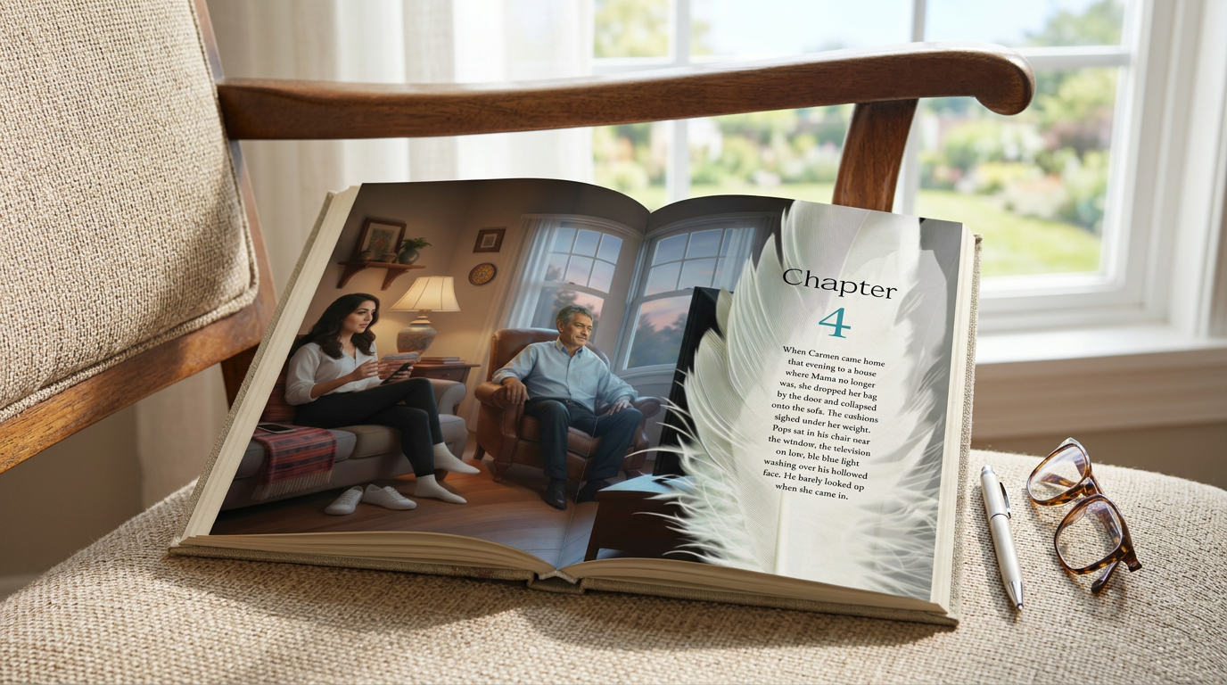
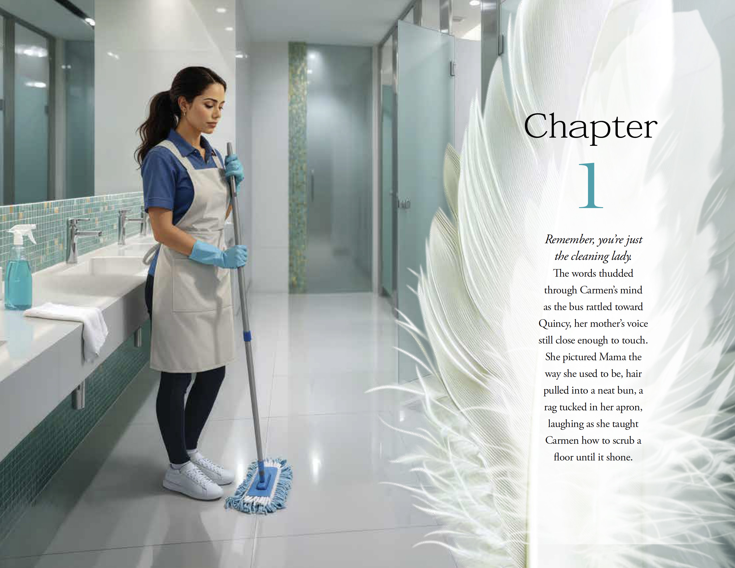
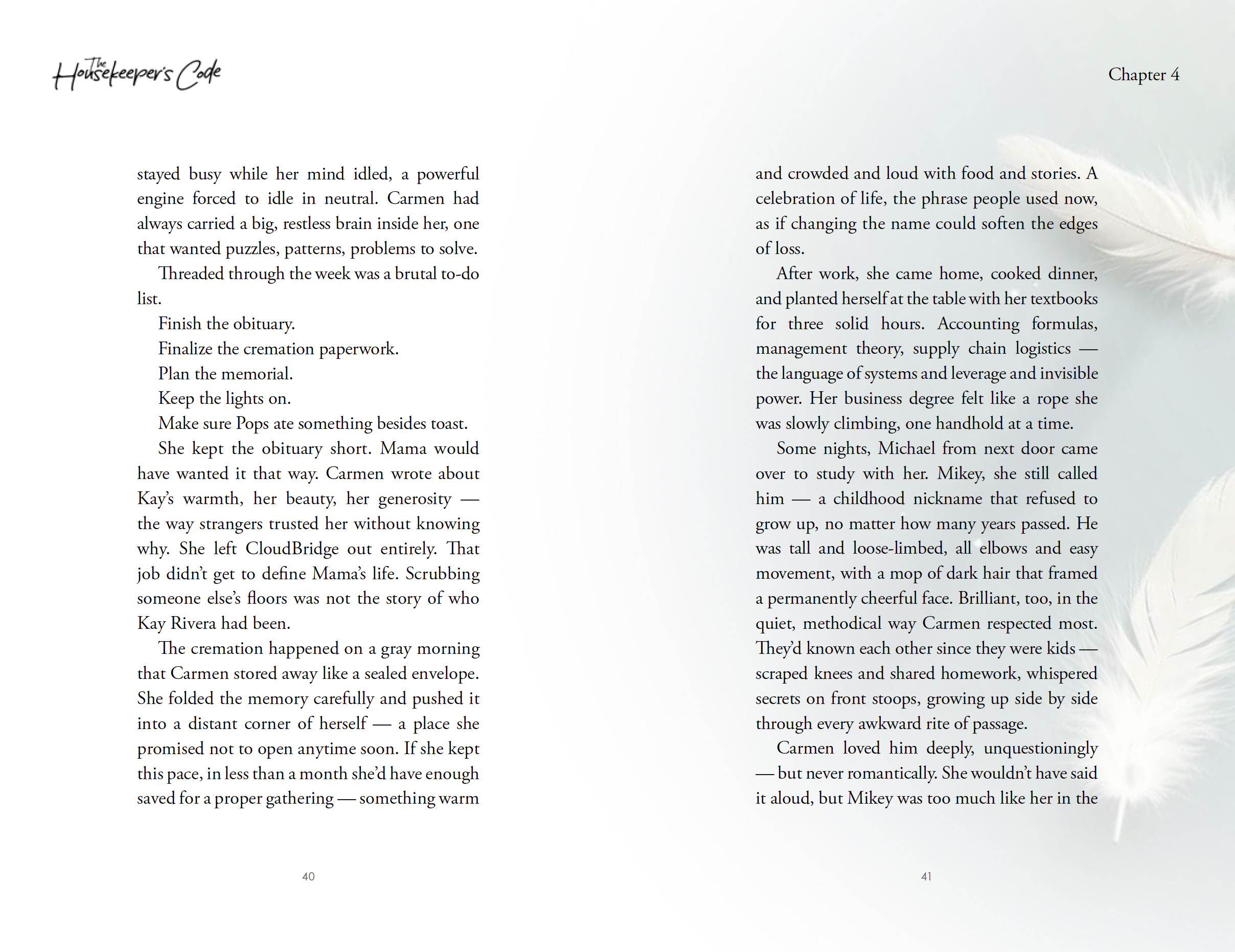
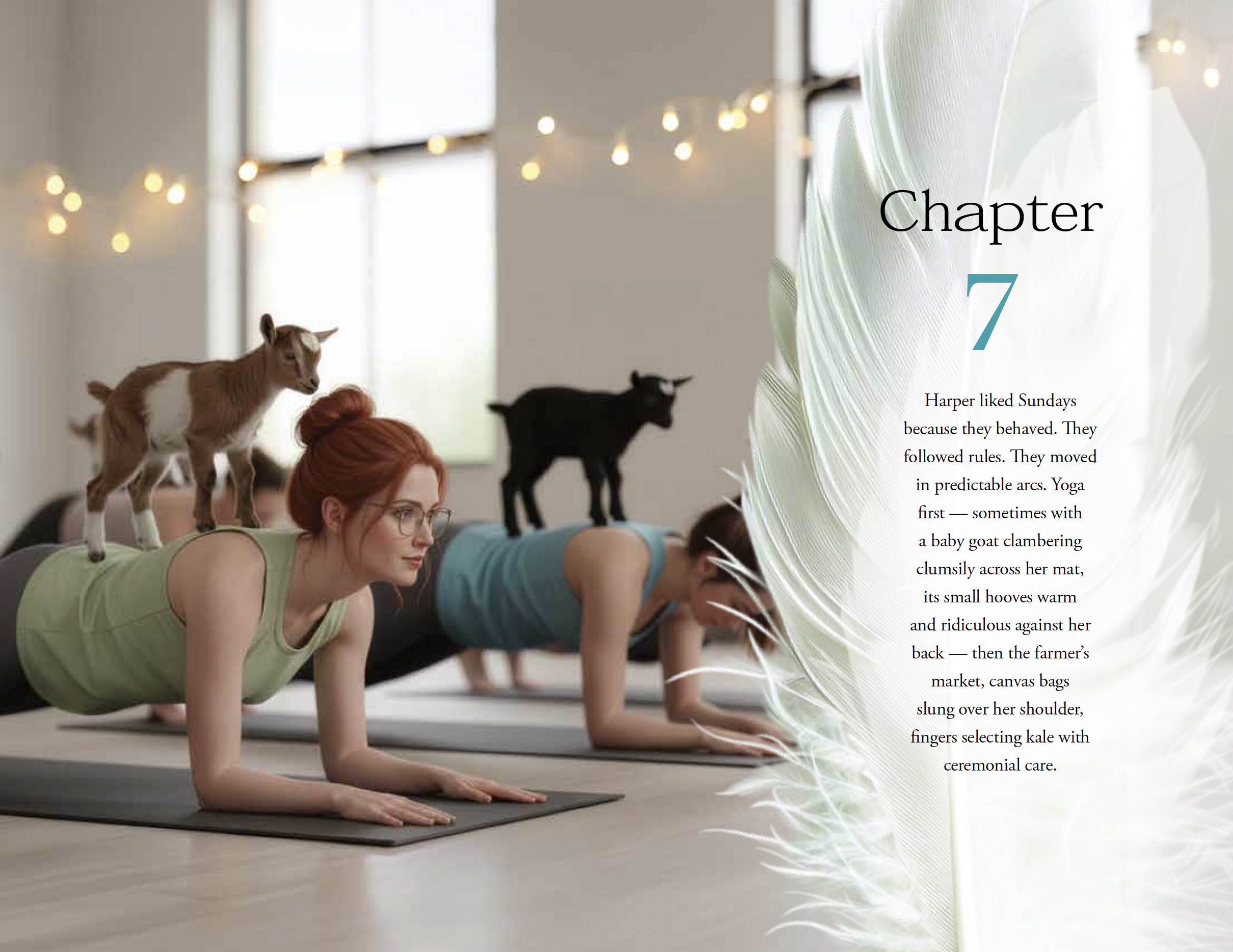
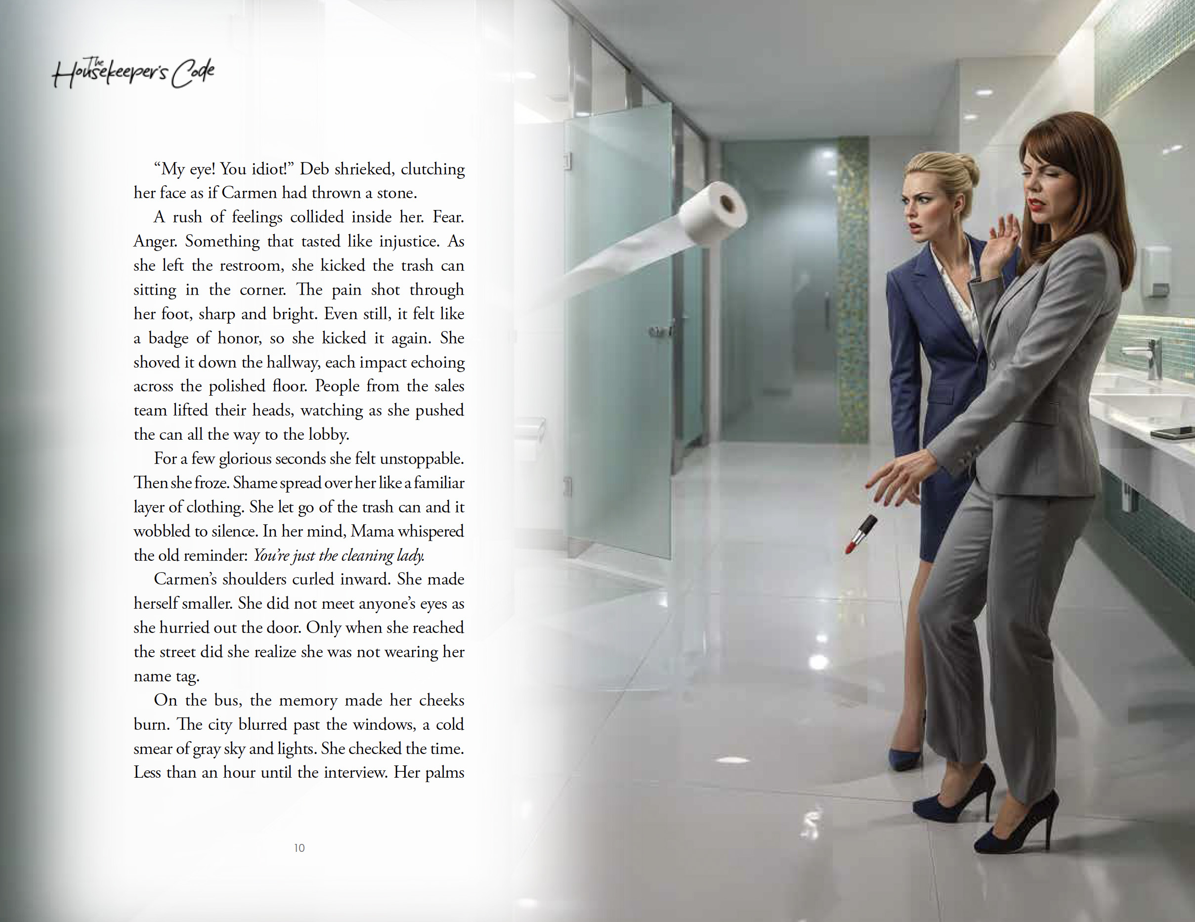
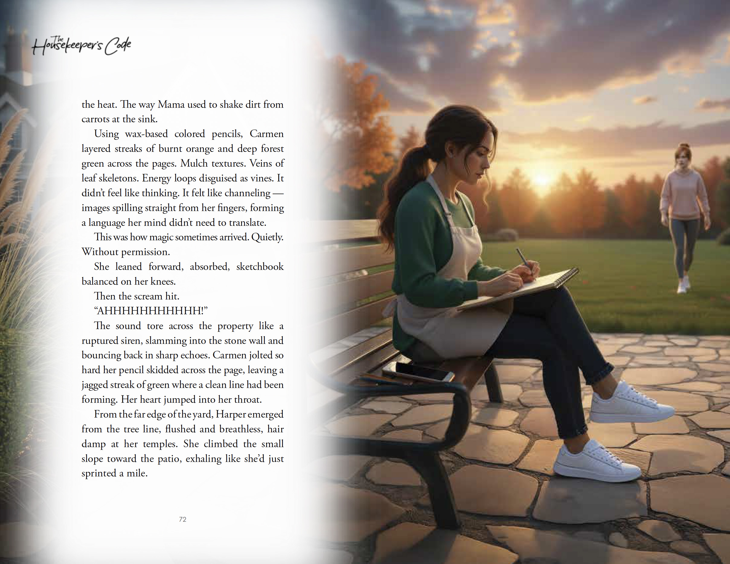
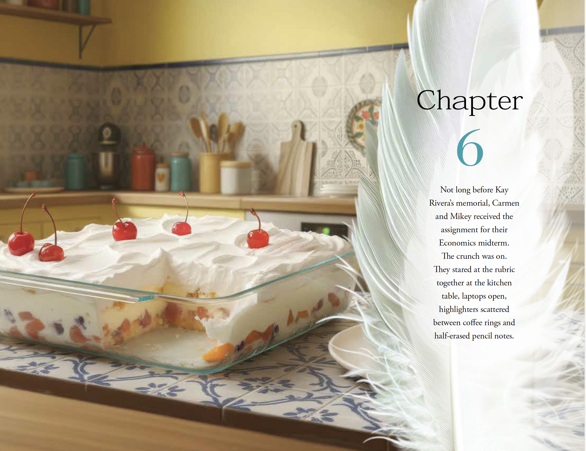
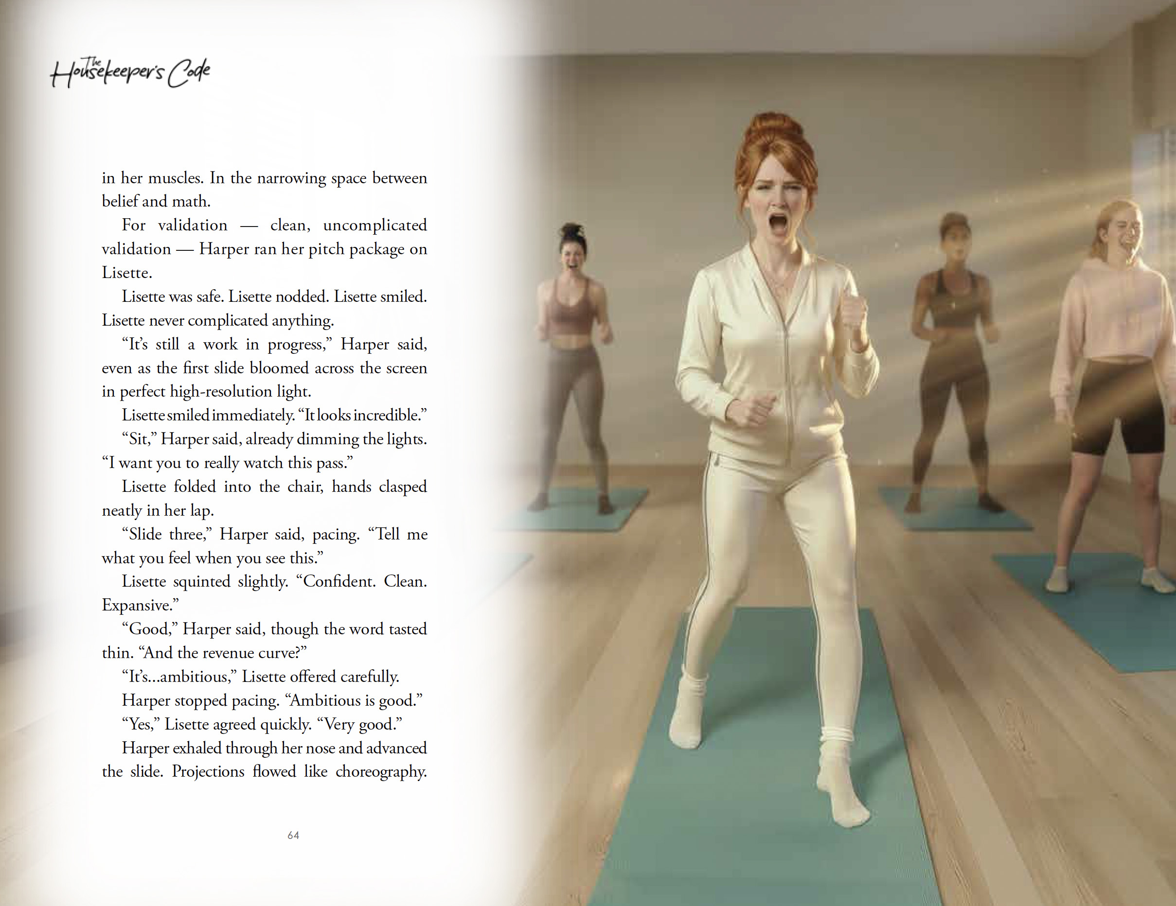
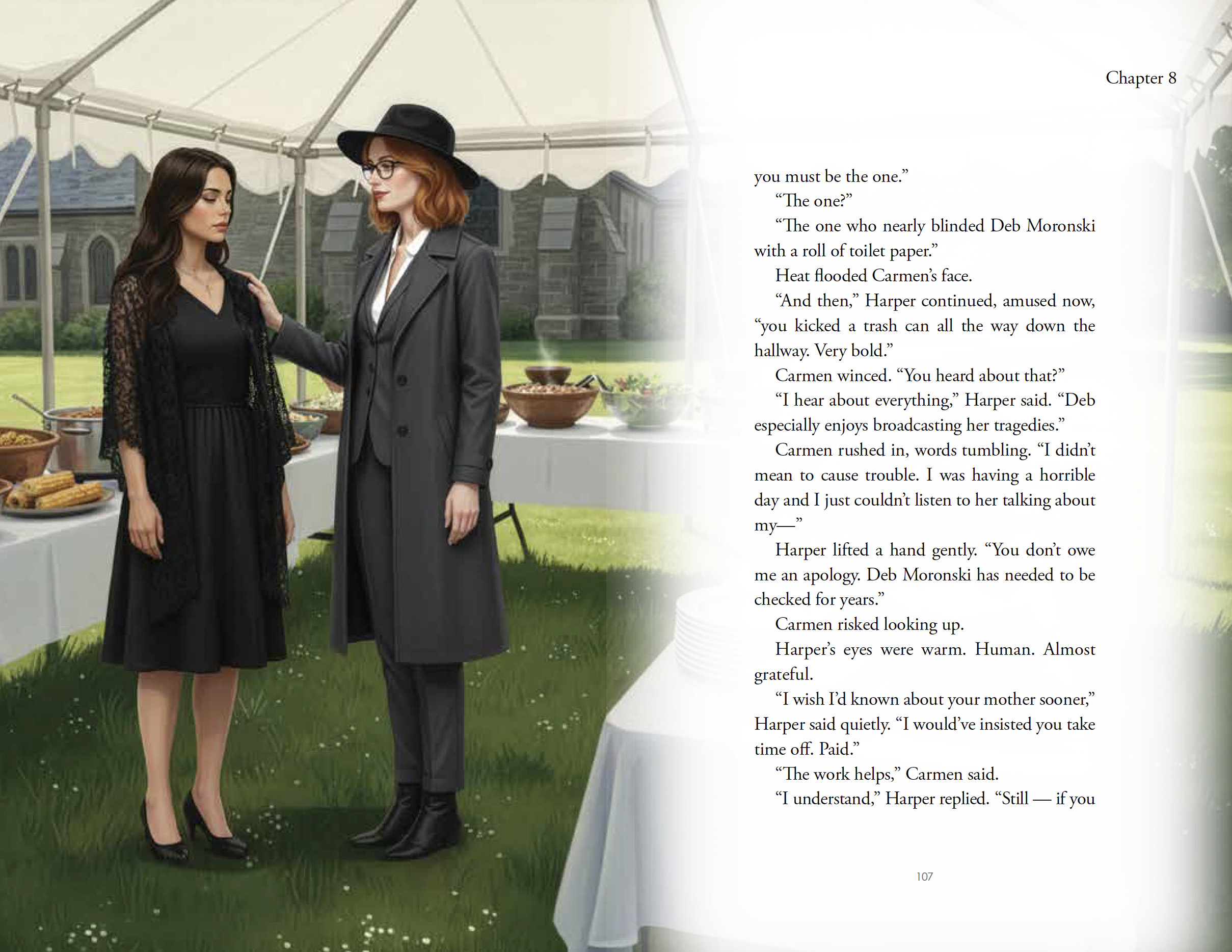
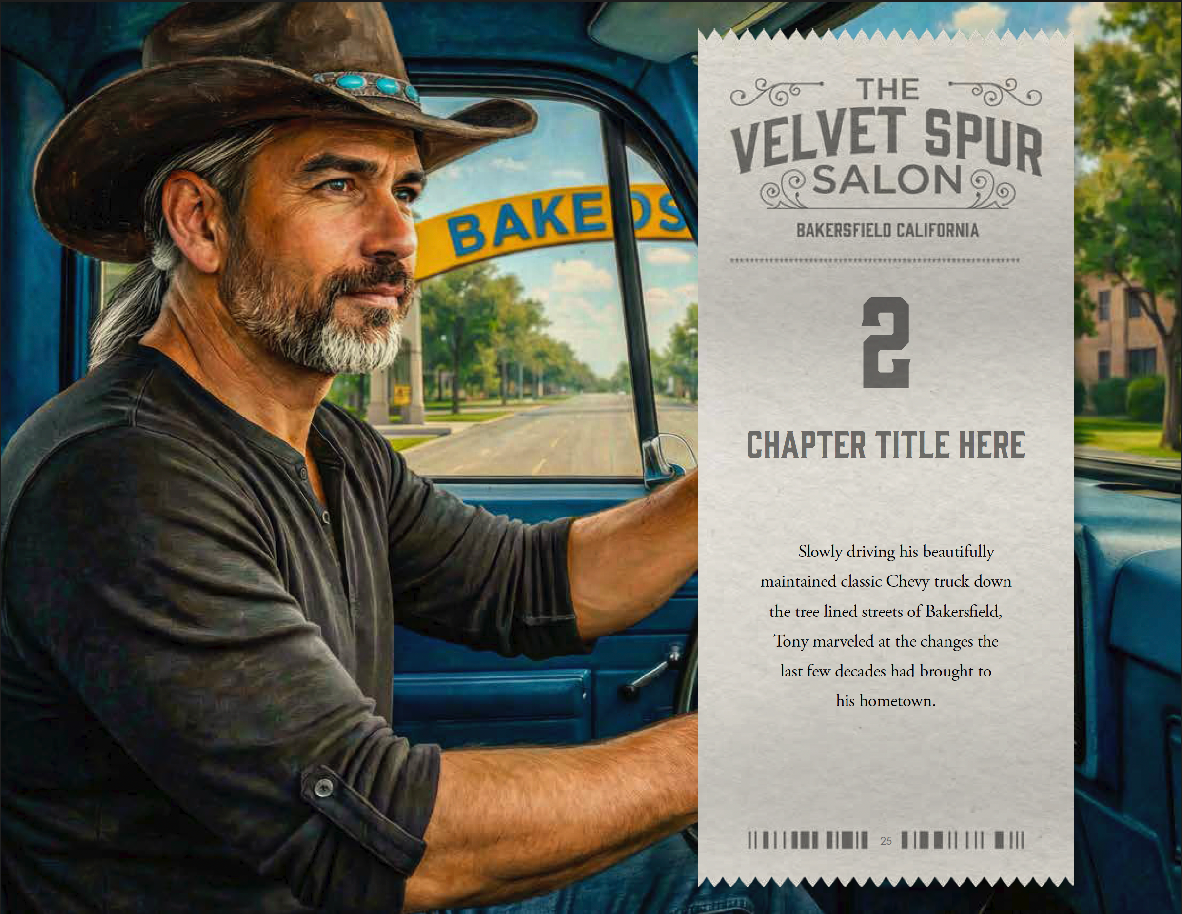
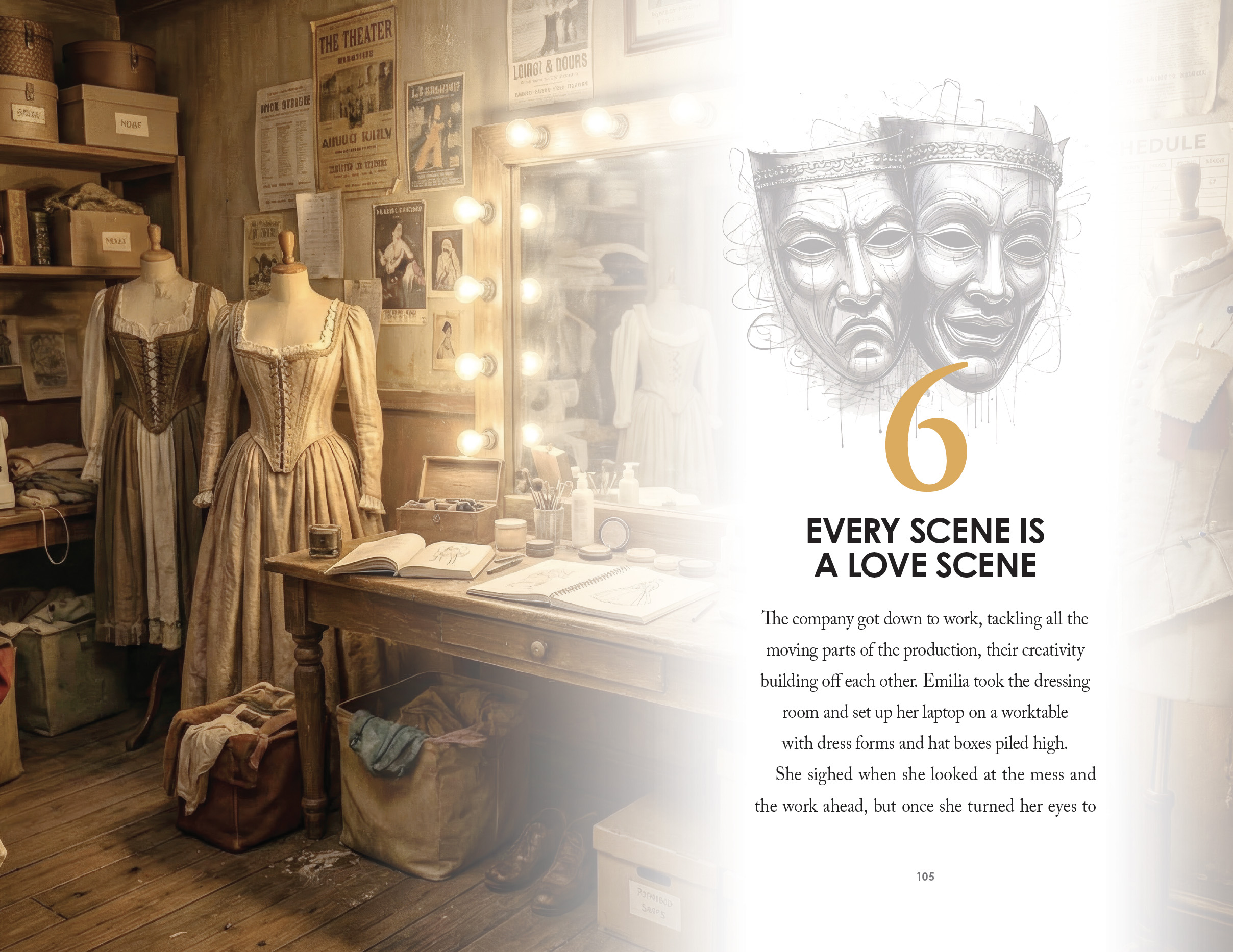
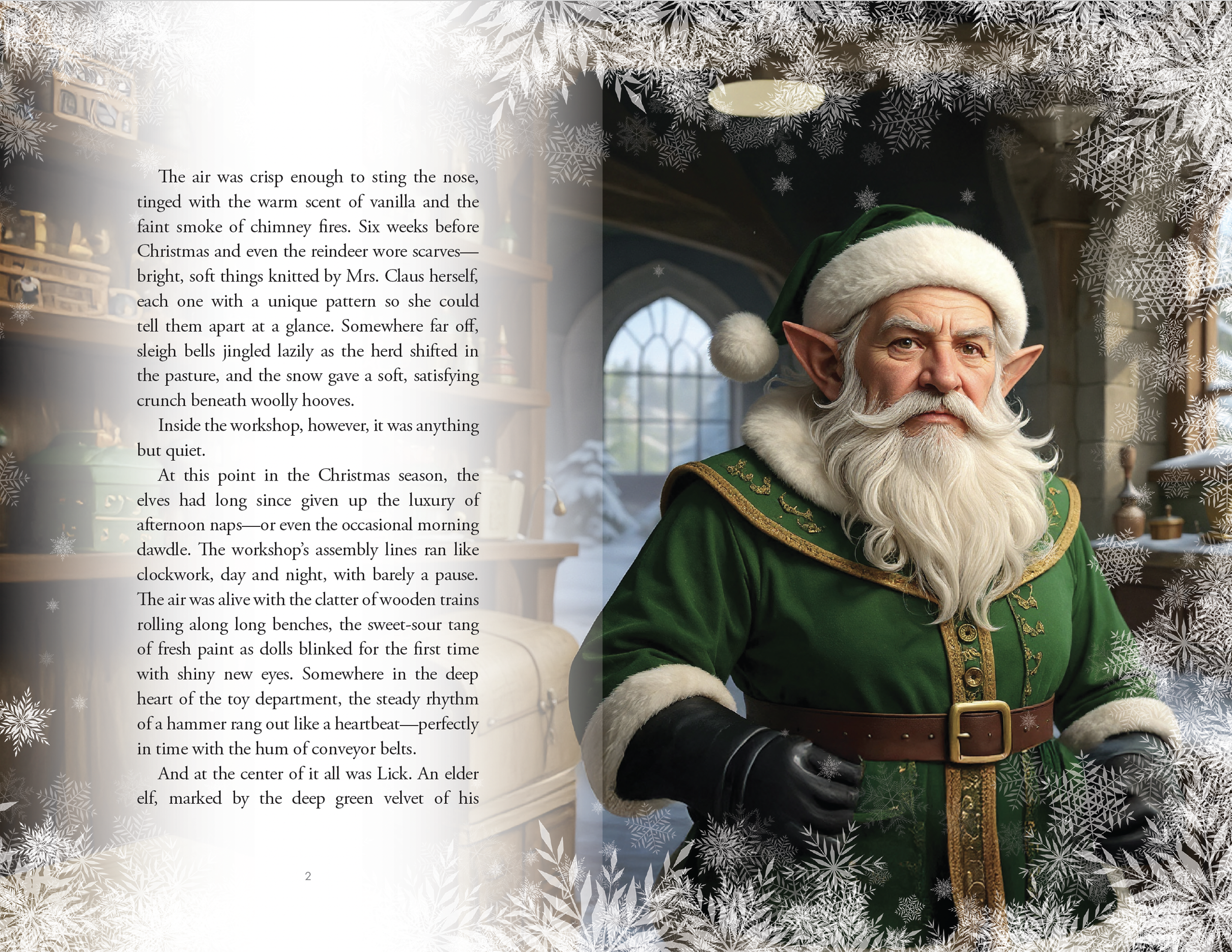
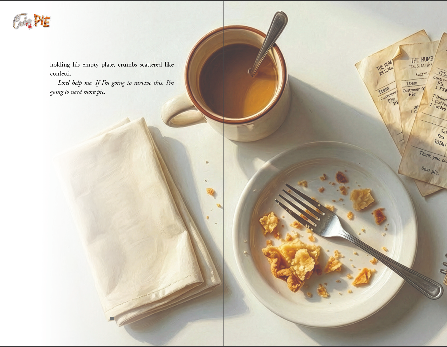
For this project, we crafted a visually cohesive interior system that seamlessly integrates handcrafted illustrations with a refined, narrative-driven layout. Our approach centered on creating immersive, full-bleed scene imagery paired with a soft, organic overlay device that houses chapter titles and opening text. This layered treatment allowed us to maintain strong visual storytelling while ensuring clarity and readability. We developed a consistent typographic hierarchy—balancing elegant serif body copy with modern accent numerals and chapter markers—to give the book a polished, contemporary feel while supporting long-form reading.
Beyond structure, we focused on building a distinctive visual language that could carry emotional continuity across chapters. Each illustration was art-directed to align with tone shifts in the story, then carefully composed within the layout to guide the reader’s eye and pacing. Subtle transitions, branded chapter treatments, and recurring graphic motifs create a sense of rhythm and cohesion from spread to spread. The result is a thoughtfully designed interior that elevates the manuscript into a fully realized visual experience—where design, illustration, and storytelling work as one.
What we did
Designed a cohesive interior layout system aligned with the book’s theatrical theme
Established clear typographic hierarchy for chapters, body text, and key moments
Integrated scene-based visuals to enhance storytelling and pacing
Structured page flow for readability, rhythm, and visual balance
Prepared print-ready files optimized for both digital and physical formats
Timeline
2–3 months from concept to final delivery
For this project, we crafted a visually cohesive interior system that seamlessly integrates handcrafted illustrations with a refined, narrative-driven layout. Our approach centered on creating immersive, full-bleed scene imagery paired with a soft, organic overlay device that houses chapter titles and opening text. This layered treatment allowed us to maintain strong visual storytelling while ensuring clarity and readability. We developed a consistent typographic hierarchy—balancing elegant serif body copy with modern accent numerals and chapter markers—to give the book a polished, contemporary feel while supporting long-form reading.
Beyond structure, we focused on building a distinctive visual language that could carry emotional continuity across chapters. Each illustration was art-directed to align with tone shifts in the story, then carefully composed within the layout to guide the reader’s eye and pacing. Subtle transitions, branded chapter treatments, and recurring graphic motifs create a sense of rhythm and cohesion from spread to spread. The result is a thoughtfully designed interior that elevates the manuscript into a fully realized visual experience—where design, illustration, and storytelling work as one.
What we did
Designed a cohesive interior layout system aligned with the book’s theatrical theme
Established clear typographic hierarchy for chapters, body text, and key moments
Integrated scene-based visuals to enhance storytelling and pacing
Structured page flow for readability, rhythm, and visual balance
Prepared print-ready files optimized for both digital and physical formats
Timeline
2–3 months from concept to final delivery
SEE SIMILAR WORK